Cinnamon Feast Font
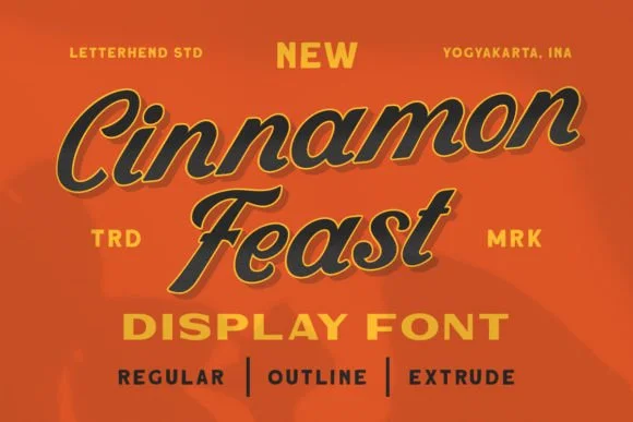
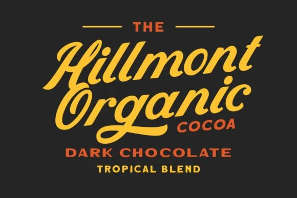
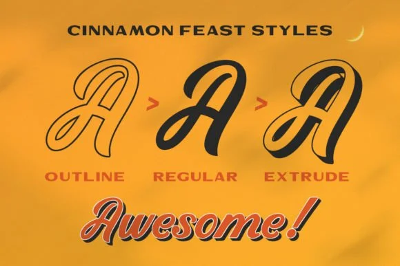
Cinnamon Feast Font is a whimsical and playful typeface characterized by its unique and hand-drawn appearance. It often captures a homemade, artisanal feel, making it a popular choice for projects that evoke warmth, charm, and a personal touch.
With its slightly irregular shapes and lines, Cinnamon Feast adds a distinct, friendly, and inviting vibe to greeting cards, invitations, branding, and creative artwork.
You can find more free Display fonts here.
Uppercase, Lowercase & Symbols Font
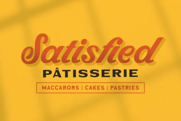
Background of Cinnamon Feast Font
Designed by the famed typographer Eliot Truelove in 2015, Cinnamon Feast Font quickly gained popularity among designers for its unique blend of playfulness and sophistication. Inspired by the cozy warmth of autumn, Truelove sought to encapsulate the essence of gathering around the table for a hearty meal with loved ones.
This font features rounded edges and soft curves, evoking a sense of comfort and familiarity. With a versatile range of weights, Cinnamon Feast offers flexibility for various design projects, from branding materials to editorial layouts. Its charm lies in its aesthetic appeal and its story—a story of warmth, togetherness, and joy.
Key Features of Cinnamon Feast Font
With its distinct personality and charming appeal, Cinnamon Feast Font has quickly become a popular designer choice. Here are some of the key features that make this typeface stand out:
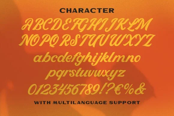
- Unique Character Set: Cinnamon Feast boasts a complete set of characters, including uppercase, lowercase, numerals, and special glyphs. Each character is designed with a whimsy touch, making it stand out.
- Handcrafted Aesthetic: With influences from script and serif fonts, its letters have a handmade look that adds a personal touch to any design.
- Versatility in Use: Perfect for everything from branding materials and packaging to wedding invitations and website headers. Its unique charm is versatile for various design aesthetics.
- Excellent Readability: Despite its decorative nature, Cinnamon Feast maintains excellent readability across different sizes, making it practical for print and digital mediums.
- Extended Language Support: It supports multiple languages, making it a practical choice for international projects.
- Special Ligatures and Alternates: Cinnamon Feast includes a range of ligatures and alternate characters, allowing designers to customize their texts for a more unique, personalized feel.
Comparison with Other Fonts
Compared to other fonts, Cinnamon Feast holds a unique position in the design world thanks to its balance of whimsy and practicality.
Script Fonts Comparison
Compared to traditional script fonts, Cinnamon Feast offers a level of readability rarely found in more elaborate script styles. Where fonts like Pacifico or Great Vibes emphasize flourishes and swoops, Cinnamon Feast focuses on clarity, making it more versatile for a broader range of applications.
Serif Fonts Comparison
Compared to classic serif fonts such as Times New Roman or Garamond, Cinnamon Feast injects a dose of personality and warmth that is often absent in these more formal options. Maintaining a structured appearance similar to serif typefaces adds a playful twist that can make designs feel more approachable and unique.
Sans Serif Fonts Comparison
In contrast with the clean lines of sans serif fonts like Helvetica or Arial, Cinnamon Feast stands out with its handcrafted aesthetic. It bridges the gap between the traditional appeal of serif fonts and the modern clarity of sans serifs, offering a hybrid that carries charisma and legibility.
Display Fonts Comparison
While display fonts are designed to capture attention at large sizes, they often sacrifice versatility for impact. On the other hand, Cinnamon Feast maintains its distinctive charm without losing functionality, making it a rare find among fonts that are both attention-grabbing and practical for various text sizes.
Tips for Using the Cinnamon Feast Font
To make the most out of Cinnamon Feast in your designs, consider the following tips:
- Pair with Complementary Fonts: For body text or to create contrast in your designs, pair Cinnamon Feast with a simple sans serif font like Roboto or Open Sans. This keeps your design balanced and reader-friendly.
- Use for Key Visual Elements: Given its distinctive look, Cinnamon Feast works best for titles, headers, logos, or any other elements where you want to draw attention.
- Experiment with Letter Spacing and Case: Adjusting the letter spacing (kerning) can dramatically alter the feel of your design. Try using all caps for a more impactful header or mix lowercase and uppercase for a playful aesthetic.
- Optimize for Print and Digital: Ensure your design maintains its readability across different mediums by testing it in various sizes and formats (e.g., print, web, mobile).
- Leverage Special Characters: Don’t forget to explore and use the ligatures and alternate characters available with Cinnamon Feast. This can add a unique, custom-designed feel to your projects.
- Mind the Color Palette: Cinnamon Feast pairs well with warm, earthy tones or vibrant, contrasting colors. The font’s notion can be enhanced or subdued depending on your color choices, so consider the overall mood you wish to convey.
- Remember Readability: Despite its decorative qualities, prioritize readability, especially in longer texts. Use Cinnamon Feast strategically to enhance your design without compromising the message.
By integrating these tips, you’ll be able to harness the full potential of Cinnamon Feast, elevating your design projects with its unique blend of charm and readability.


