Beatrix Font
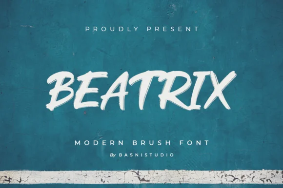
Beatrix Font is a contemporary typeface known for its unique blend of classical elegance and modern design principles. It features a distinct set of characters with varying weights, making it versatile for digital and print mediums.
With its clean lines and refined curves, this font is often chosen for branding, editorial designs, and sophisticated web content, embodying a style that is both timeless and forward-thinking.
You can find more free Display fonts here.
Uppercase, Lowercase & Symbols Font

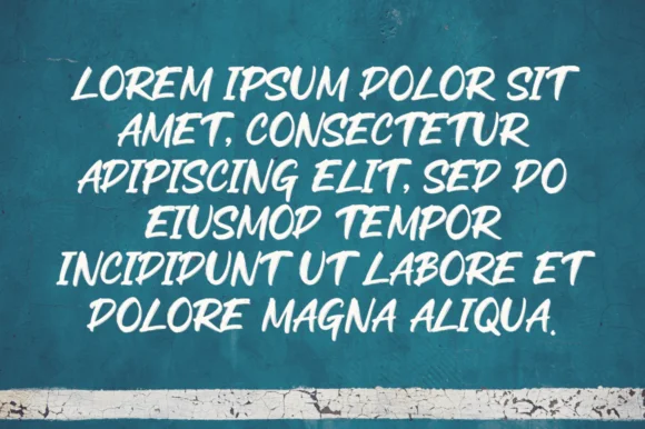
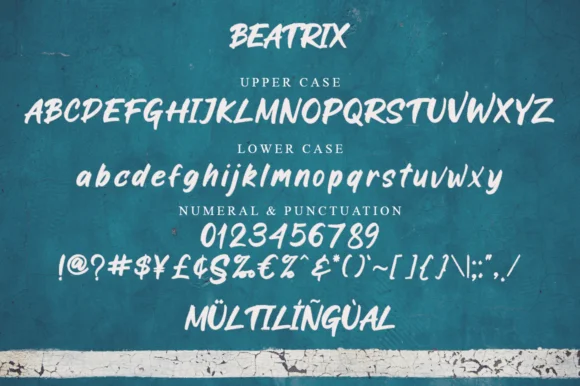
History of Beatrix Font
Beatrix Font is an homage to the golden era of arts and crafts, where every letterform was a testament to artisanal skill and meticulous attention to detail. The font draws inspiration from late 19th-century and early 20th-century lettering—periods marked by bold experimentation and the birth of historic movements in design.
Originating from the illustrious pen of British designer Caroline Noar, this font was crafted with an explicit purpose: to offer contemporary designers a bridge to the past. It recaptures the essence of typographic ornaments from the Arts and Crafts movement, instilling modern design projects with a breadth of historical significance.
Applications of Beatrix Font
This font is a versatile typeface that lends itself to various applications. Its bold yet delicate appearance makes it the perfect choice for branding and packaging projects, giving it a distinguished character.
Editorial Design
Beatrix Font shines in editorial design, where its sophisticated charm enhances magazine headers, book titles, and content page listings. The font’s intricate details and unique character make it a go-to choice for publications that aim to stand out while paying homage to classic aesthetics. Its versatility complements various themes, from historical non-fiction to avant-garde fashion magazines.
Branding and Identity
This font offers a distinctive voice to brands seeking a blend of tradition and modernity in branding and identity. Whether used in logos, business cards, or marketing materials, this font adds depth and personality, enabling brands to convey their story elegantly and authentically. It suits artisanal businesses, luxury brands, and cultural institutions prioritising craftsmanship and heritage.
Digital Media
Even in digital contexts, Beatrix Font stands strong, bringing its vintage appeal to websites, digital magazines, and e-books. Its readability and characterful design make it a suitable choice for headlines and decorative elements, providing a bridge between historical artistry and contemporary digital interfaces. It serves as a functional choice for navigation and emphasis and as a design element that enriches the user experience.
Creative Projects
This font offers endless possibilities for creativity for artists and designers working on personal or collaborative projects. Its historical roots inspire projects that require a touch of nostalgia, while its well-crafted design supports a wide range of applications, from poster art to product packaging. Utilizing this font in creative projects invites an exploration of history through the lens of modern design, fostering a connection between the creator and past traditions.
Key Features of Beatrix Font
Beatrix Font stands apart in its attention to detail and commitment to reviving classic craftsmanship. Its key features include:
- Crafted Detailing: This font is celebrated for its exceptional attention to detail. Each character is designed with intricate strokes and flourishes that recall the hand-crafted letterforms of the Arts and Crafts movement.
- Versatile Weights: The font family includes a range of weights from light to bold, enabling flexibility in design applications, from subtle body text to impactful headlines.
- Character Set: It boasts an extensive character set, supporting multiple languages. This inclusivity ensures that designers worldwide can utilize this font in various contexts.
- Ligatures and Alternates: This font offers a selection of ligatures and alternate characters, allowing designers to add a unique touch to their typography and avoid repetition.
- Great Readability: Despite its ornate details, this font maintains high readability across sizes, making it an excellent choice for print and digital mediums.
- Historical Essence with a Modern Twist: The font seamlessly blends vintage charm with contemporary clarity, making it suitable for projects that bridge different design eras.
How to Use Beatrix Font
Integrating Beatrix Font into your design projects enhances their aesthetic appeal and infuses them with a sense of history and craftsmanship. Here are some tips and considerations for using this font effectively:
Choosing the Right Context
Identify the projects that would benefit most from this font’s unique qualities. Its historical charm is well-suited for projects that evoke a sense of tradition, elegance, and depth. Consider using it in contexts where the design seeks to stand out, such as luxury branding, bespoke packaging, or thematic publications.
Pairing with Complementary Fonts
While Beatrix Font can serve as an attention-grabbing headline or logo font, choosing complementary fonts for body text or secondary information is crucial. Opt for simple, clean sans-serif or serif fonts that do not compete with Beatrix’s intricate details. A good rule of thumb is to pair it with fonts that share a similar x-height and proportion but are less ornate.
Experimenting with Weights and Styles
Take advantage of the range of weights this font offers. Use lighter weights for body text or subtle details, and reserve bolder weights for headlines or statement pieces. Experimenting with various weights within the same design can create a harmonious hierarchy and depth.
Utilizing Ligatures and Alternates
To fully capture the essence of this font, explore its ligatures and alternate characters. These features can add a unique flair to your design, making it stand out. Using these special characters thoughtfully can elevate the overall aesthetic of your project.
Considerations for Digital Use
When incorporating Beatrix Font into digital projects, ensure that it maintains its readability across different devices and screen sizes. Test the font in various contexts, such as web headers, digital ads, or mobile interfaces, to guarantee seamless integration. Employing this font in digital designs underscores a blend of innovation with tradition.
Mindful of Licensing and Usage
Always ensure you have the appropriate license to use this font, especially in commercial projects. Understand the terms of use to avoid any legal issues and support the font’s creators.

