Carnivalee Freakshow Font
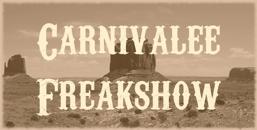
Carnivalee Freakshow Font is a decorative typeface that evokes the early 20th-century American circus and carnival posters. Characterized by its ornate and exaggerated letterforms, this font captures the essence of the traditional, vintage style of showbiz advertising.
Its unique and attention-grabbing appearance makes it ideal for titles, headers, and any context where a theatrical flair is desired.
You can find more free Western fonts here.
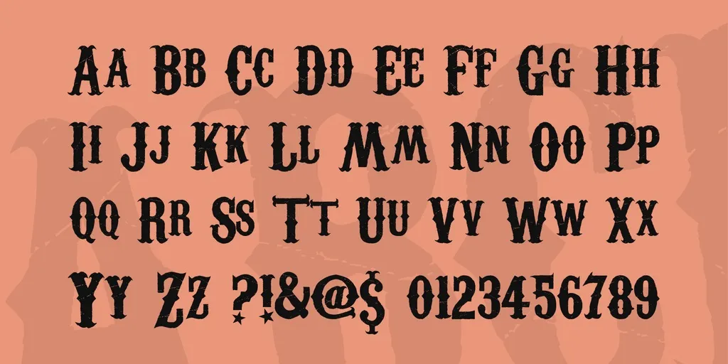
Uppercase, Lowercase & Symbols Font
History of Carnivalee Freakshow Font
The tale of Carnivalee Freakshow Font begins with the imagination of Patrick Griffin, a type designer at Canada Type. Launched in 2008, Carnivalee brought the essence of 19th-century circus posters into the digital era with a modern twist. It wasn’t just about recreating the past; it was about curating an aesthetic that spoke to the boldness and eccentricity of the circus motif.
Griffin’s work captured the essence of a time when circus posters were the epitome of graphic design, full of boisterous exclamation marks, elaborate scripts, and a penchant for the dramatic. The font’s name embodies the themes it brings forth — carnival, with its promise of entertainment, and freak show, with its edge of the bizarre.
Characteristics of Carnivalee Freakshow Font
Carnivalee Freakshow Font distinguishes itself with a set of unique characteristics that make it stand out in the crowded world of typefaces:
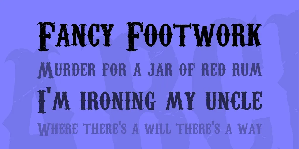
- Appearance: It features thick, heavy strokes reminiscent of the show-stopping headlines on vintage circus posters, making it ideal for capturing attention in logos, headers, and posters.
- Versatility: Despite its distinct vintage flair, Carnivalee Freakshow is surprisingly versatile and suited for various projects, from event invitations to thematic graphic designs.
- Decoration: The font includes decorative elements that enhance its circus-inspired theme, such as exaggerated serifs and ornamental curves, adding a layer of authenticity to the design.
- Legibility: Designed for impact, each letter is crafted to stand out, ensuring that despite its decorative nature, the font remains legible, even at smaller sizes.
- Personality: With its unique blend of the whimsical and the eerie, Carnivalee Freakshow carries a strong personality. It’s not just a typeface; it’s a statement piece, imbuing any project with the spirit of the spectacle.
Tips for Using Carnivalee Freakshow Font
As with any typeface, there are some best practices for utilizing the full potential of Carnivalee Freakshow Font:
Choose the Right Project
Carnivalee Freakshow is not a one-size-fits-all typeface. It thrives in environments that call for a distinctive, vintage aesthetic. Consider using it for projects such as thematic party invitations, vintage store branding, or any design that aims to evoke nostalgia or the thrill of the circus.
Pairing with Other Fonts
When using Carnivalee Freakshow, choosing the right font to pair it with is crucial. For body text, opt for simple, legible fonts that do not compete for attention. Fonts like Arial or Calibri work well, providing a clean contrast and ensuring your design remains balanced and readable.
Mind the Sizing
Given its detailed and decorative nature, Carnivalee Freakshow performs best in larger sizes where its intricacies can be fully appreciated. Use it for headlines, titles, or any focal point in your design. When using this font in smaller sizes, watch out for legibility.
Color Considerations
Carnivalee Freakshow’s vintage character is further accentuated with the right color choices. Earth tones, deep reds, or muted golds complement its historical essence, while bold and vibrant colors can bring out its more whimsical side.
Testing Across Mediums
Ensure that your design maintains its impact across various platforms. Whether print, digital, or mixed media, Carnivalee Freakshow’s boldness should translate effectively. Testing will help you identify adjustments needed to maintain legibility and aesthetics across different mediums.
Respect the Atmosphere
Remember, Carnivalee Freakshow carries a strong visual identity that may not suit every context. It’s important to consider your design’s cultural and emotional connotations to ensure that the font aligns with the message you intend to convey.

