Fayte Font
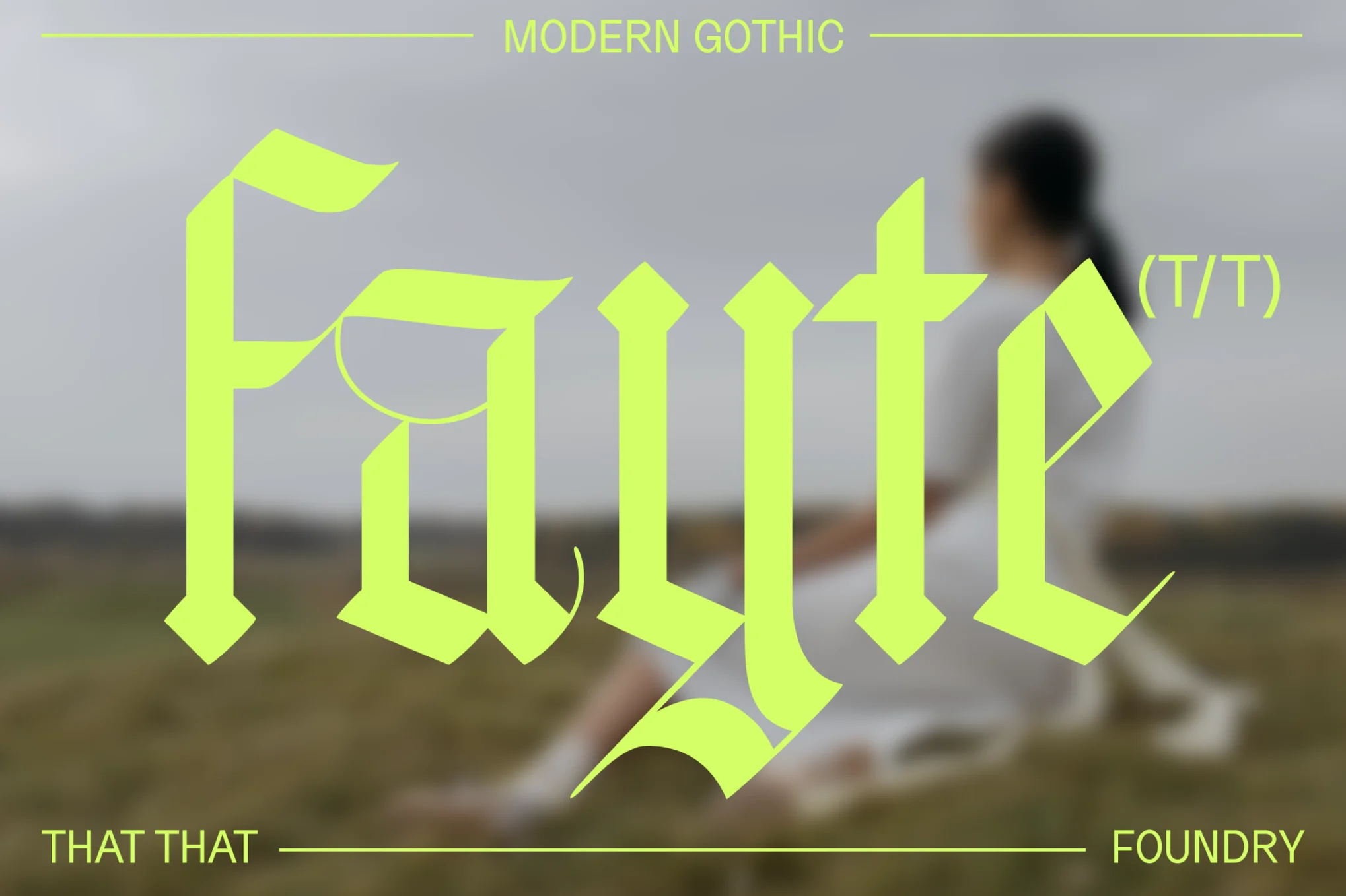
Fayte Font is a modern font that has a smooth stroke that serves especially for web and printing publication purposes. It unites modernism with legibility, it is as testimonial and adaptable as sans serif typefaces can be, thus it became one of the trends in branding, advertisement, and Web design.
The font has no gaudy features, making it versatile to fit in various design environments, whether complex or simple. With rather elegant and balanced shapes, it helps that the letters are not very decorative, but the character is quite unique; It can lend a certain exclusive resonance to any design work.
You can find more free Blackletter fonts here.
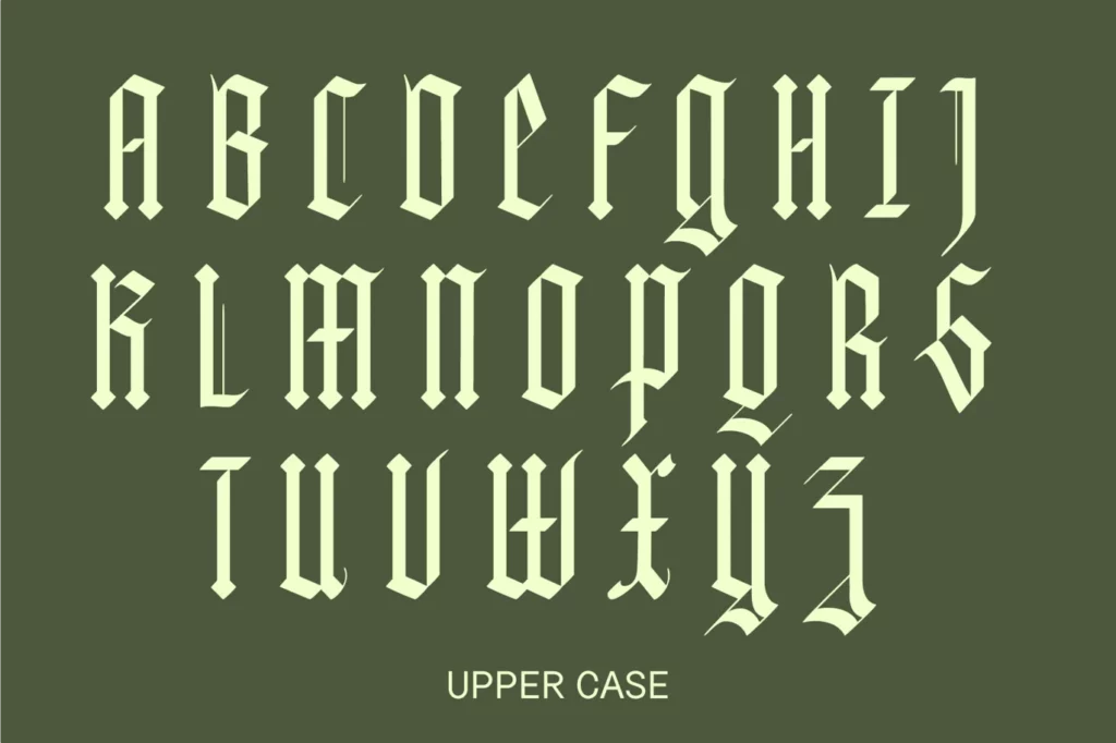
Uppercase, Lowercase & Symbols Font
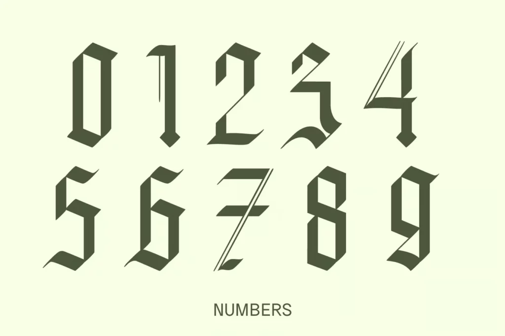
Origin of Fayte Font
As with many other post-modernist typefaces, Fayte Font developed from the typographical design segment that cropped out with the demand for a typeface that balances stylized beauty and functionality. Developed by a group of creative minds, the creation of this font drew its basis on simplicity and usability.
It was designed based on classical serif and non-serif fonts, and the authors tried to occupy an intermediate position between classic elegance and modern minimalism. The combination of the above led to a typeface that captured both modern design and applied aspects and typographic heritage. This font is the first font that received great attention and became popular in nearly all design fields shortly after its release.
Features of Fayte Font
- Versatile Use: Fayte Font can also be used for web design, graphic design, and branding to promote advertisement since the font styles are adaptable for online and offline projects.
- Elegant Simplicity: Versatile in design, it comes with sleek shapes and proportional forms to blend well with simple and complex designs.
- Highly Readable: On both the Headline and Body text usage, the curves on the font’s characters are barely noticeable, yet the figures’ design is quite easy to read.
- Modern Aesthetic: This font, completed in 2013, offers modern design solutions with references to antique motifs that give every project an elegant look.
- Broad Character Set: A wide set of characters and accents is also comfortable for use in texts of different languages and with special types of fonts, of this font.
- Design Adaptability: They can easily be combined with other types of faces, and therefore, it is versatile in their design, They enable designers to come up with with rich typographic designs.
- OpenType Features: This font features various open-type tools, making it more stylistic with stylistic alternations and ligatures, among others.
Tips for Using Fayte Font
Here are some tips for using Fayte Font:
1. Selecting the Right Context
However, when selecting this font for the project, there is more information about it that one needs to consider. It is more suitable for today’s brand and project since it has a clean, official look.
2. Pairing with Other Typefaces
To make the composition pop comfortably, align Fayte Font with other typefaces. For example, it is best used with loud serif typefaces for a traditional retro effect or plain sans-serif for a neat, professional touch.
3. Emphasizing Hierarchy
In the context of typography, make type size and styles vary between light and bold within Fahy Font. Thin styles can be applied to the body of the text, and bolder font types can be used for headings, thus compelling attention.
4. Considering the Color Palette
Try modifying how the colors in Fayte Font that you want to use will interact with your chosen colors. It does this by having a clean design which makes it easy for it to pop in bright colors as seen below, however its versatility can make it look even better in a more neutral color.
5. Exploring OpenType Features
Every style includes opportunities to open more tools – stylistic alternates and ligatures – to add more style and complexity if needed.
6. Maintaining Readability
Fayte Font can be used both as a display and for body texts, although one should always preview the texts’ result on various backgrounds, or if shrunk down, the text must remain easily readable for the audience.
7. Adapting to Different Languages
It is a wide character set that can support different languages and other special characters. It also ensures that your design maintains flexibility throughout the implementation process, incorporating design features that work well with persons of different abilities.
This font is free for personal use; click here for commercial use.

