Gotcha Font
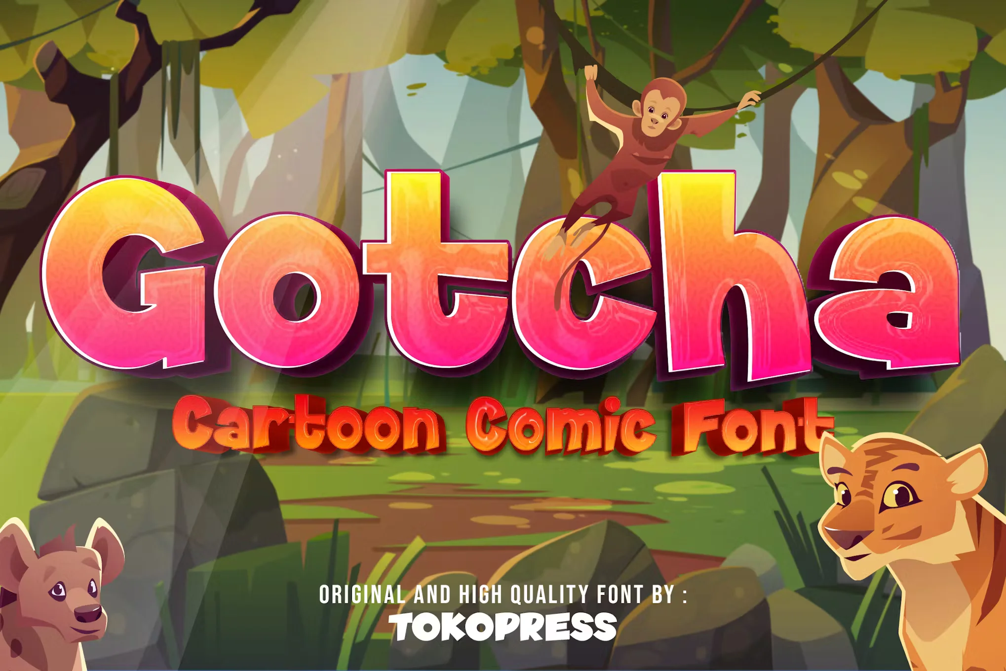
Gotcha Font is a playful and dynamic typeface known for its unique and expressive character designs. It often exudes a sense of whimsy and creativity, making it a popular choice for projects that aim to stand out or convey a lighthearted tone.
With its distinctive style, Gotcha Font is ideal for graphic designs, advertising, and any media that benefits from a touch of visual excitement and personality.
You can find more free Comic fonts here.
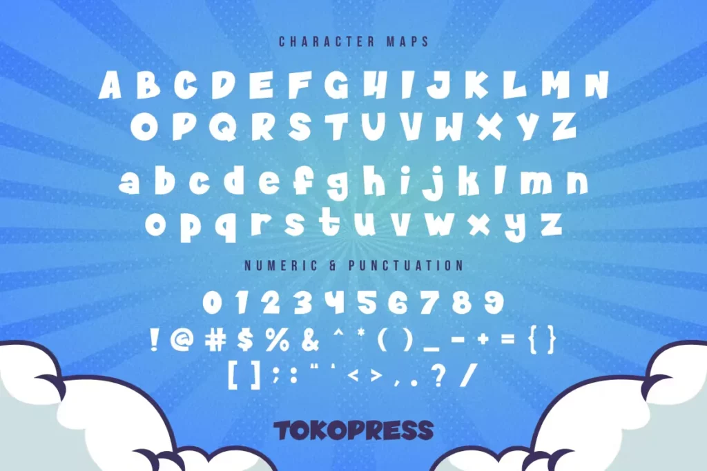
Uppercase, Lowercase & Symbols Font

Key Features of Gotcha Font
Here are some key features of Gotcha Font:
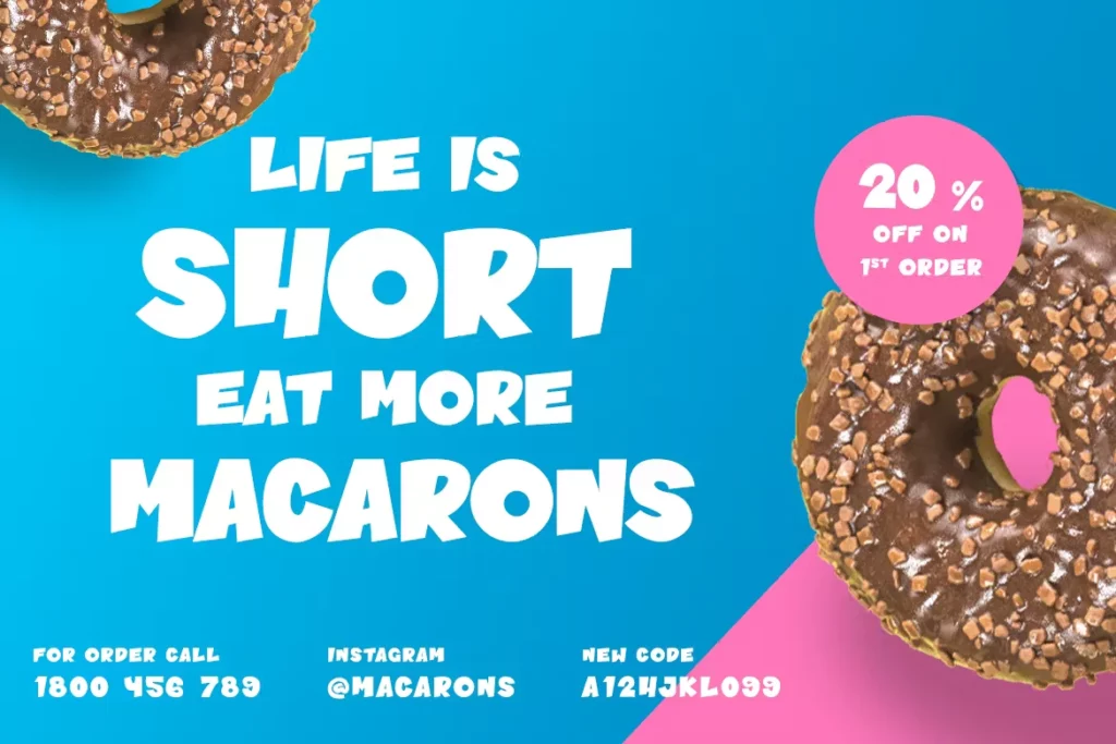
- Visual Appeal: One of the most striking features of this font is its visual impact. The thick, heavy strokes make it immediately visible from a distance, ensuring that any message presented in this font can stand out in a crowd.
- Readability: Despite its bold display, Gotcha is designed with excellent readability in mind. The counterforms are generous, and the x-height is appropriate, making it easy for extended reading on the eyes.
- Versatility: Gotcha can adapt to various design contexts without losing its unique character. It plays well with other fonts and can be paired to create striking contrasts or complement other typefaces harmoniously.
Usage of Gotcha Font
The applications of Gotcha Font are as vast as the open ocean. It suits signage, logos, headlines, and anything that requires a commanding presence. Its usage extends from print media to digital platforms, making it a favourite among web designers.
Print Media
This font is popular for magazine headlines, book covers, and posters in print. It adds a touch of sophistication and a modern edge to traditional media.
Digital Platforms
On the web, Gotcha can elevate a website’s design, especially its headlines, landing pages, and banners, where a solid first impression is crucial.
Tips for Using Gotcha Font
Here are tips for using Gotcha Font:
- Pairing with Other Fonts: While Gotcha is a standout on its own, pairing it with another font can enhance its features. Opt for a complementary sans-serif or a serif with a lighter weight to create a balanced layout.
- Scale Appropriately: In design, the size of the typeface is as crucial as its choice. Scale this font appropriately to its space, ensuring it maintains its readability and visual impact.
- Mind the Context: Gotcha can be versatile, but it’s not a one-size-fits-all typeface. Consider the context and the message. It won’t be the best choice for long, small body texts but will shine in larger, more prominent elements.

