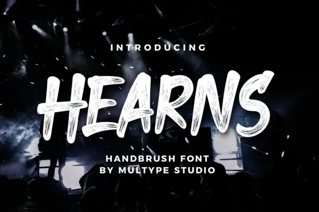
Hearns Font

Hearns Font is a typeface characterized by its unique blend of elegance and modernity. Designed to cater to a wide range of applications, from digital platforms to printed materials, Hearns ensures readability and aesthetic appeal.
Its versatile nature encompasses a variety of weights and styles, making it suitable for headlines, body text, and branding purposes.
You can find more free Blackletter fonts here.
Uppercase, Lowercase & Symbols Font


History of the Hearns Font
Originating from the typographical renaissance of the late 19th century, the Hearns Font draws inspiration from classic serif types. Updated for contemporary users, the font maintains its historic roots while staying relevant in a digital era replete with sans-serif types. This font is versatile because of the symmetrical serifs, rhythmic squareness, and distinctive, large x-height.
Use of Hearns Font in Graphic Design
Graphic designers are drawn to this font for its ability to convey the brand’s personality. The font’s bold yet elegant presence suggests a sense of permanence. When used correctly, Hearns can add a touch of sophistication to any marketing material, from business cards to social media campaigns.
Branding With Hearns
The vintage aesthetic of Hearns Font aligns beautifully with brands that hark back to traditional values. It has found a niche in the branding of artisanal products, luxury goods, and heritage services. The emphasis on craftsmanship and detail in its letterforms mirrors the values of such brands, making Hearns a natural fit for their visual identity.
Editorial Use
This font is a strong headline contender in the editorial sphere due to its robust and assertive nature. It pairs well with classic and modern sans-serif fonts, creating an engaging visual hierarchy in articles and publications. The font’s legibility also makes it a popular choice for book covers and titles where a commanding presence is essential.
Digital Design
This font provides a distinctive touch for digital marketing and web design, making content stand out. When implemented with responsive design principles, this font adapts gracefully to various screen sizes, bringing flair to brands’ online presence without sacrificing readability.
Key Features of Hearns Font
Hearns Font exhibits several key features that make it especially attractive for a wide range of design applications:
- Versatile Serif Design: The font perfectly balances the classic appeal of serif fonts and the cleanliness of modern typefaces, making it suitable for both print and digital mediums.
- High x-height: This characteristic enhances its readability, particularly in smaller sizes, making it an ideal choice for body text and headings.
- Unique Letterforms: Each character in this font has been meticulously designed, featuring unique curves and edges that give the font its distinctive look.
- Weight Variations: The font comes in multiple weight variants, from light to bold, allowing designers to use it across different contexts and requirements.
- Large Set of Glyphs: This font includes a comprehensive set of glyphs, supporting various languages and special characters essential for global brand identities.
- Optimized for Screen and Print: It is meticulously refined for screen and print applications, ensuring its integrity and readability across all mediums.
- Compatibility: The font is compatible with various design software, making it easily accessible for all designers.
How to Incorporate Hearns Font in Your Designs
Now that we’ve explored the aesthetic and functional strengths of the Hearns Font, it’s time to discover how to incorporate it into your designs effectively. Here are some best practices for integrating Hearns into your projects.
Pairing with Complementary Fonts
Pair Hearns with sans-serif fonts for balance to create an engaging typographical palette. This font provides the classic, serif-driven foundation, while a complementary sans-serif can inject a modern or casual element. Be mindful of contrast and ensure that the combined fonts enhance readability and hierarchy.
Enhancing Visual Hierarchy
Incorporate this font to establish a clear visual hierarchy in your designs. Use it for headlines and prominent text to capture attention and guide the viewer’s eye. Balance the sizing and weight of your typographic elements to maintain a harmonious flow.
Paying Attention to White Space
White space is as vital as the text itself. This font allows ample breathing room around the text to prevent a cluttered look. The font’s robust serifs and lines benefit from generous margins, enhancing the overall design and making the content more digestible.
Customizing Hearns Font
Explore the realm of custom typography by tweaking the spacing, size, or even the style of the Hearns Font to suit your project’s specific needs. Consider using small caps or adjusting the kerning to create a unique, tailored look that integrates seamlessly with the overall design aesthetic.
Applying in Different Media
Apply this font across various media with discernment. Adjust the size, weight, and style to optimize legibility and visual impact. What works well in a print advertisement may not translate effectively to a website or social media graphic.


