Mego Font
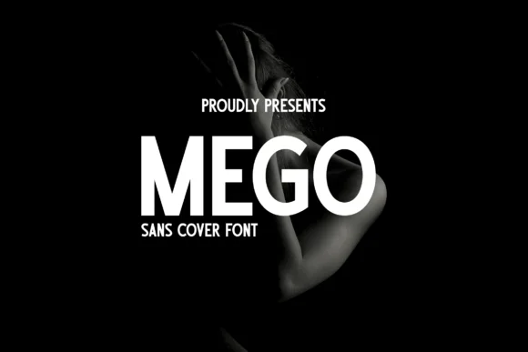
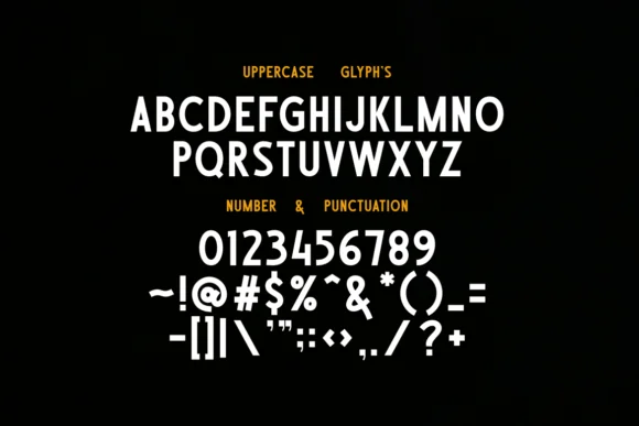
Mego Font is a modern, versatile typeface with clean lines and geometric shapes. It is designed to balance readability and stylistic flair, making it suitable for a wide range of applications, from digital interfaces to printed material.
With its contemporary look, Mego Font supports an extensive array of characters, catering to diverse languages and typographic requirements.
You can find more free Slab serif fonts here.
Uppercase, Lowercase & Symbols Font


History of Mego Font
In the kaleidoscopic world of typography, Mego is a font that represents an era. Its creation story is intertwined with the dynamic zeitgeist of the 1960s, born from the need for a typeface that captured the essence of that revolutionary period. The designer’s vision was simple yet profound – to develop a font that translated the global cultural shifts into tangible letterforms.
Mego font’s inception is credited to a small team of designers who, inspired by the modernist movement’s geometrical shapes, sought to create a typeface that mirrored the bold experiments in art and society during that time. It was a radical departure from the traditional serifs and script fonts that dominated the previous decades, marking a new chapter in typographic design.
Key Features of Mego Font
Mego font is distinguished by several unique characteristics that define its appearance and usability across various mediums. These key features include:
- Geometric Shapes: The typeface incorporates simple geometric shapes, such as circles, triangles, and squares, reflecting the modernist influence and creating a distinct, contemporary look.
- Clean Lines and Sharp Edges: Mego font features clean, crisp lines and sharp edges, offering a sleek, modern aesthetic that stands out in digital and print formats.
- Versatile Weight Range: From ultra-light to heavy, Mego comes in various weights, making it incredibly versatile for different design needs, ranging from body text to bold headlines.
- Open and Airy Letterforms: The letters are designed with ample space in and around them, ensuring readability and a balanced, open appearance that enhances its application in minimalist designs.
- Consistent Stroke Width: Unlike many fonts that exhibit variation in stroke width, Mego maintains a consistent stroke throughout, contributing to its modern and harmonious aesthetic.
Applications of Mego Font
The versatility of Mego font extends across various applications, making it a favoured choice among professionals in diverse fields. Here are some of the key areas where Mego shines:
1. Web Design and Digital Content
Mego’s clean lines and geometric shapes make it an excellent choice for web design, where readability and visual impact are paramount. It’s equally effective in digital content, such as e-books and online publications, where its open letterforms ensure legibility on screens of all sizes.
2. Branding and Logo Design
For brands aiming for a modern and minimalistic appeal, Mego offers the perfect blend of simplicity and sophistication. Its sharp edges and consistent stroke width enable designers to create memorable logos and branding materials that stand out.
3. Editorial and Print Materials
Mego’s versatility across weights makes it suitable for body text and headlines in print. Magazines, brochures, and posters benefit from its sleek appearance, which adds a contemporary touch to physical media.
4. UI/UX Design
Mego’s geometric consistency and readability lend themselves well to user interface (UI) and user experience (UX) design. It contributes to clear navigation and a cohesive design aesthetic in apps and software, enhancing the overall user experience.

