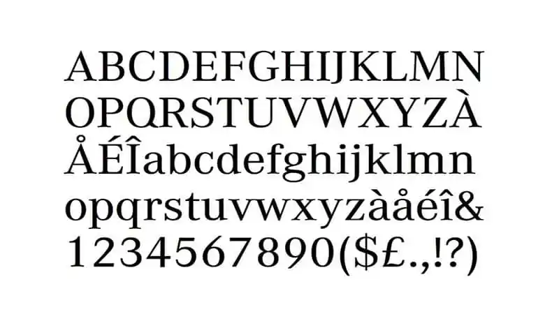
Mercedes Benz Font

Mercedes Benz font, often called “Corporate A,” is a bespoke typeface developed specifically for the Mercedes Benz brand. It exhibits a clean, modern aesthetic that aligns with the luxury and precision of the automotive leader.
Characterized by its minimalist design, the font features a unique blend of geometric and humanist elements, offering a broad appeal and enhancing readability across various mediums. This font encapsulates the brand’s commitment to elegance, quality, and innovation, making it a core element of Mercedes Benz’s visual identity.
You can find more free Logo fonts here.
Uppercase, Lowercase & Symbols Font

History of the Mercedes Benz Font
Like the brand, the Mercedes Benz Font is a timeless symbol. It was in the 1920s that the roots of this unique typeface were sown as Mercedes-Benz took steps to establish a consistent and recognizable visual identity. The font’s evolution correlates with the automobile industry’s shift towards a more design-conscious era.
The typeface’s inception reflected the brand’s fusion of elegance and engineering excellence – a philosophy that continues to drive the company today. The font was refined and digitized over the years, but its original essence remains engrained in the sleek lines and taut curves that typify the badge it adorns.
Characteristics of the Mercedes Benz Font
Mercedes Benz Font, often regarded as a paragon of design within the world of automotive branding, possesses several distinctive characteristics:
- Legibility and Clarity: The Mercedes-Benz typeface stands out for its exceptional legibility and clarity, ensuring that the brand’s name is recognizable at a glance. This is crucial for maintaining the brand’s prestige and visibility in a competitive marketplace.
- Elegance and Strength: The font exudes elegance and strength, mirroring the design and performance ethos of Mercedes-Benz cars. Its clean lines and balanced proportions suggest a blend of luxury and power.
- Sleekness and Modernity: With sleek lines and a modern aesthetic, the typeface aligns with the brand’s forward-thinking approach to car design. It evokes a sense of innovation and cutting-edge technology.
- Timelessness: Despite minor updates and refinements, the Mercedes-Benz font has maintained a timeless quality over the years. It bears a classic look that transcends trends, reflecting the brand’s enduring appeal.
- Custom Design: Unlike off-the-shelf fonts, the Mercedes-Benz typeface was custom-designed for the brand. This bespoke approach ensures uniqueness and a strong visual identity, setting the brand apart from competitors.
Importance of the Mercedes Benz Font
The significance of the Mercedes Benz Font transcends mere aesthetics, embodying the brand’s heritage, ethos, and unwavering commitment to excellence. This section explores the multifaceted importance of this distinctive typeface.
Symbolic of Brand Heritage
This font is a direct nod to Mercedes-Benz’s storied history, echoing its legacy of innovation and excellence in automotive engineering. The brand honours its past while steering toward the future by maintaining elements of the typeface designed in the 1920s, thus embedding a sense of continuity and timelessness in its visual identity. This historical acknowledgement reinforces customer trust and loyalty.
Enhances Brand Recognition
The custom font is a crucial tool for distinguishing Mercedes-Benz from other automotive manufacturers in a landscape crowded with competitors. Its unique characteristics ensure that the brand is instantly recognizable, whether on vehicle badging, advertisements, or digital platforms. This immediate recognition bolsters Mercedes-Benz’s visibility in the global market, securing its position as a premiere automotive brand.
Communicates Brand Values
The Mercedes Benz Font is not just a design choice; it’s a strategic communication tool that conveys the brand’s core values. The elegance and strength reflected in the font mirror the luxury and performance that Mercedes-Benz vehicles are known for. It visually communicates the company’s dedication to precision, quality, and innovation, allowing customers to perceive and connect with these values at every touchpoint.
Supports Global Brand Consistency
Employing a distinctive, custom font across all communications ensures consistency in the brand’s visual identity worldwide. This uniformity is key to building a cohesive and powerful brand image that resonates with customers across different cultures and regions. It strengthens the global presence of Mercedes-Benz and ensures that the brand is recognized and remembered by audiences everywhere.
Enhances Customer Experience
Finally, the clarity and legibility of the Mercedes Benz Font contribute significantly to a positive customer experience. Whether navigating the brand’s website, reading a brochure, or glancing at a billboard, customers interact with the brand through its typeface. The font’s accessibility ensures seamless interactions, enhancing customer engagement and satisfaction.


