Nela Slab Font
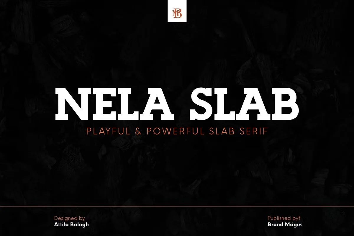
Nela Slab Font is a contemporary typeface combining slab serif designs’ readability with a modern, streamlined aesthetic. Characterized by its thick, block-like serifs and balanced proportions, the Nela Slab offers a robust and versatile option for both print and digital media.
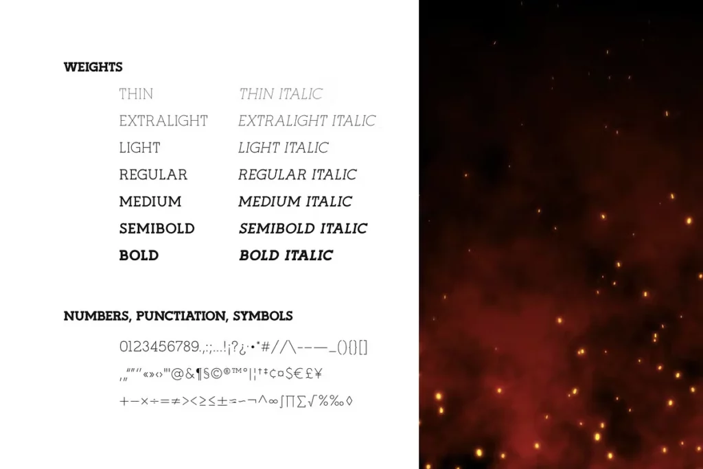
Designed to provide clarity and impact in various contexts, it supports a wide range of weights and styles, making it suitable for headlines, body text, and everything in between.
You can find more free Slab serif fonts here.
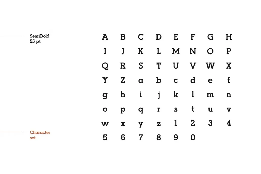
Uppercase, Lowercase & Symbols Font

History of Nela Slab Font
At its core, Nela Slab Font is a reflection of the enduring charm of serif typefaces. Born at the nexus of modern design principles and the historic forms of typography, it stands as a testament to the intricate history of type design. Its lineage can be traced back to the origins of typography, all the way back to the fifteenth century when the printing press enabled mass publication and standardization of fonts.
Despite the dominance of sans-serif fonts in the digital sphere, the trusty serif is enjoying a resurgence. Nela Slab emerged at a time when designers sought to infuse boldness and character while ensuring readability in a range of media, from print to digital. Its birth was a response to this call, incorporating traits that have historically been part of typographic excellence, such as high contrast, thick serifs, and refined letterforms. This font fuses the old and new by embodying classical elegance and vitality necessary for the contemporary design landscape.
Key Features of Nela Slab Font
One of the standout aspects of Nela Slab Font is its unique mix of features that accommodate both traditionalists and modernists in the design world. Here are some key attributes:
- Versatility in Application: Nela Slab is designed to excel across a variety of platforms, making it suitable for print media, web design, and digital marketing materials.
- Wide Range of Weights: It offers an extensive range of weights, from light to bold, allowing designers to create hierarchy and contrast in their typography.
- Distinctive Serifs: The font is characterized by its pronounced serifs, which add a touch of elegance and structure, improving readability.
- Modern Proportions: While it honors traditional serif aesthetics, Nela Slab features modern proportions, making it more accessible and legible in digital contexts.
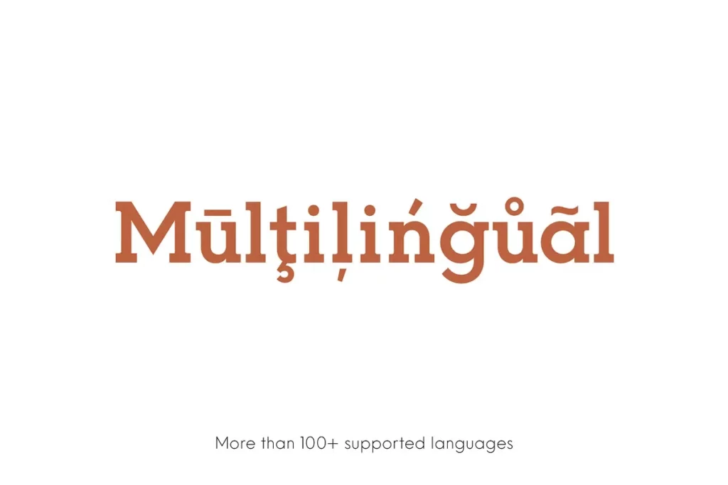
- Character Set: Nela Slab comes with a comprehensive character set, supporting multiple languages and special characters, ensuring global usability.
- OpenType Features: It includes advanced OpenType features like ligatures, fractions, and swashes, giving designers the flexibility to add unique touches to their text.
Typography Tips for Using Nela Slab Font
Typography can often be the unsung hero of design, quietly influencing the viewer’s experience. When using Nela Slab Font, it’s important to keep certain guidelines in mind to maximize its potential and create harmonious designs.
Pairing with Complementary Fonts
One of the most powerful tools in a designer’s kit is the ability to pair typefaces that complement each other. Nela Slab, with its strong character, pairs well with a range of sans-serif fonts, providing a balanced contrast. When selecting complementary fonts, consider those that share a similar x-height and weight to maintain visual harmony within your design.
Consistency in Style
Consistency in the application of Nela Slab across your designs is crucial. Establish a hierarchy and stick to it. Use the various weights and styles to denote different levels of importance, but ensure that this hierarchy remains consistent throughout your project. Consistency in style not only ensures readability but also lends a professional touch to the finished product.
Pay Attention to Spacing
The spacing between letters, known as kerning, and the spacing between words, called tracking, plays a significant role in the legibility of any typeface. For Nela Slab Font, a slightly looser kerning and tracking can enhance its elegant appearance. However, be careful to not overdo it, as excessive spacing can harm readability. Adjust the spacing based on the size and format of the text to achieve an optimal balance.
Factor in Readability Across Formats
Consider the various media where your typography will errors occur during generation. Please try again or contact support if it continues.

