Ransom Font
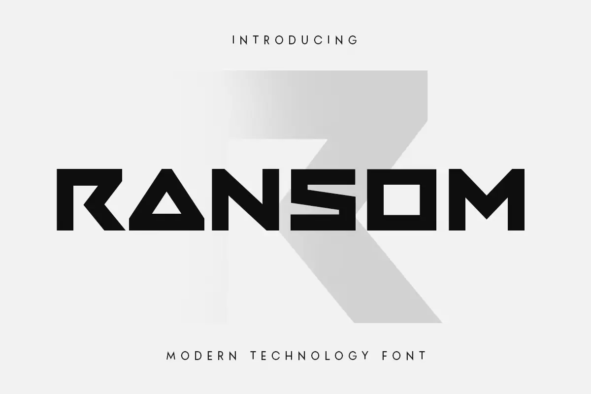
Ransom font is designed to look like letters cut out of magazines or newspapers, like a ransom note. This font usually has unpredictable shapes and sizes of characters, inconsistent thickness, and acute angles; as such, its appearance resembles that of a collage to give a sense of urgency and curiosity.
It is mainly used in graphics, where it contributes the feeling of playfulness, creativity, or mystery for tasks that need ornamented or non-traditional appearance.
You can find more free Sports fonts here.
Uppercase, Lowercase & Symbols Font
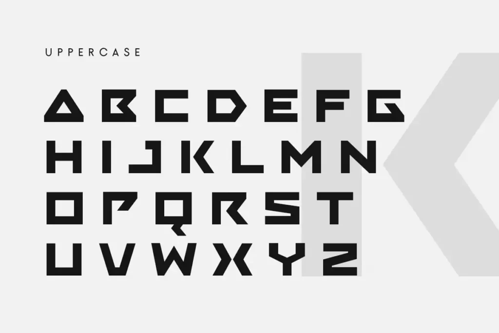
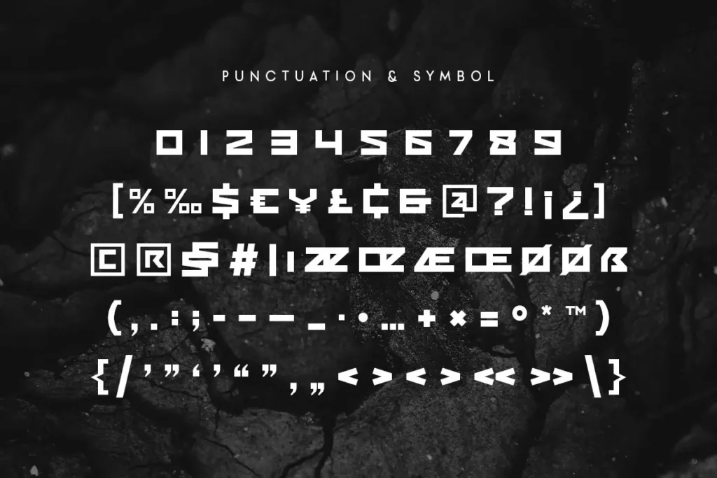
History of Ransom Font
The origins of Ransom Font can be seen in the collage art movement of the early twentieth century when artists started using scissors and paste to cut different materials before joining them to form a new piece. During this period, the technique of employing letters from different sources was more evident, especially in propaganda and advertisement.
Ransom notes, popularised in popular culture, used this style to elude the sense of urgency and danger, adding to their sense of crime and mystery. Gradually, graphic designers realized that this kind of letter style is unique and unconnected; therefore, the Tradition of this font was set in the late twentieth and twenty-first centuries.
Nowadays, this font is applied throughout the designs, becoming a worldwide phenomenon in the design industry. It is used for posters, album covers, branding, and advertising, reflecting a combination of retro and contemporary styles.
Elements of Ransom Font
- Irregular Shapes: Although all letters in this font are more or less simple, their shapes differ from the original geometric patterns, and edges can be distinct and unpredictable, making the overall effect unique.
- Varying Widths: The letters in words can have varying thicknesses, adding to each word’s disruptive layering aspect and energy.
- Unexpected Angles: The tops and bottoms of the letters can be pointed or rounded, making the typeface appear playful but edgy, which attracts the audience’s attention.
- Mixed Character Sets: To preserve Ransom Font’s originality, letters and numbers are borrowed from other sources, and different typefaces are inserted, which contributes to its non-traditional look.
- Layered Textures: For depth and visuals, most font copies mimic the decals typical for the cut-paste artwork.
- Contrasting Styles: The use of both upper- and lowercase lettering and different types of font makes the designs interesting and somewhat random.
- Colour Variance: As mentioned, this font is often written in black and white; however, using colours is also possible, referring to a style called collage.
How to Use Ransom Font
If employed correctly, this font can add a creative element to your work and make it stand out. Here are some tips for incorporating this typeface into your designs:
1. Select the Right Context
Ransom Font is versatile when used in an environment requiring emphasis and curiosity. It should be used where the goal is to attract attention and convey urgency or playful connotations, for example, in headlines, posters, marketing material, or any other graphical content.
2. Combine with Complementary Fonts
This font should be used with simpler traditional fonts to increase visibility and establish the textual content hierarchy. This can reduce some of its randomness, affecting its effective usage while at the same time providing for the imposition through callouts of certain messages.
3. Experiment with Layout
Therefore, due to the irregular shapes and width variation, one needs to experiment on the layout designs. Additional text such as the text placed on top of the other, distorting letters, or placing letters in a position that seems unconventional can play a major role in the design.
4. Use Colour Strategically
On occasion, Ransom Font can appear rather bold when solely used in limited shades of grey; however, adding various colours can enhance the font’s playful and artistic tone. To attract Peoples attention use bright colours on the background and dark colours on the foreground.
5. Maintain Clarity
As the font is chosen, this font is more irregular in appearance; the text should still be clearly readable no matter the size. Do not overload designs with text and keep the message simple yet effective as possible.
6. Consider Your Audience
When inciting the use of this font, contemplate your audience and the perception you would like them to come to. This font is unconventional and may not be suitable for certain projects, so check if it garners the emotions you want for your project.
This font is free for personal use; click here for commercial use.


