Rough Spray Font
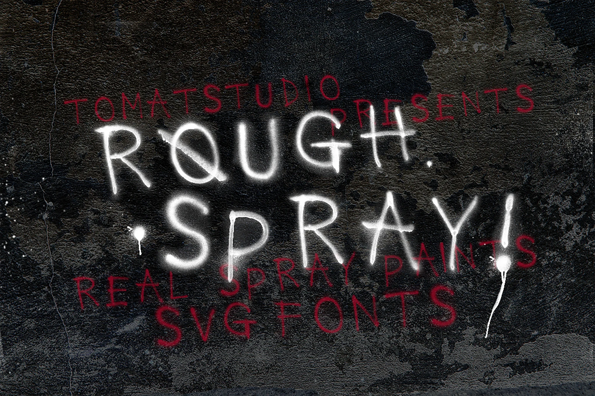
Rough Spray Font is a unique font that seeks to imitate the aesthetic of spray paint work, and it looks like the result of drawn handwriting. This font is inspired by urban arts and most often has a rebellious touch of street art associated with modern culture.
Due to irregular lines and non-systemized style, this is very useful for projects where you want to make it look artistic or raw and edgy. In graphic design, it is well-suited for promotional works, posters, and merchandise that would appeal to younger generations or enthusiasts of the raw look.
You can find more free Brush fonts here.
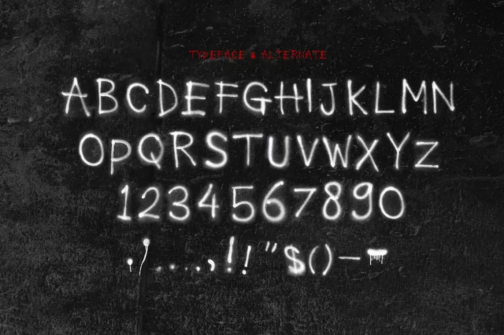
Uppercase, Lowercase & Symbols Font
History of Rough Spray Font
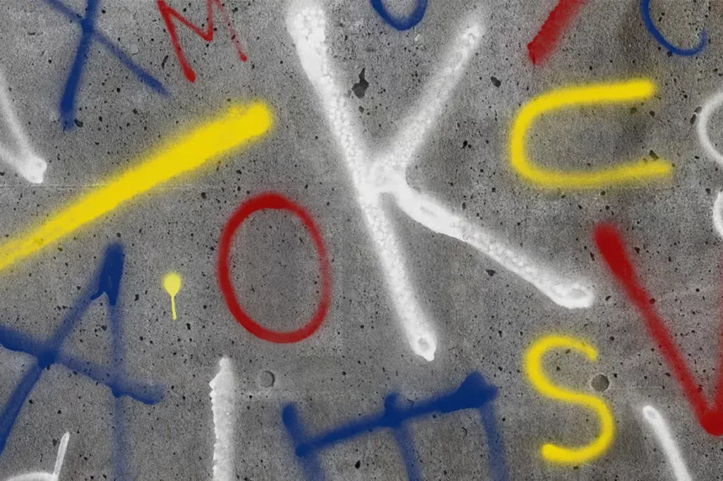
It is possible to associate the history of Rough Spray Font with the history of street art and graffiti in urban settings during the second half of the twentieth century. Over time, the genre started diversifying, and artists strived to inscribe themselves into the urban fabric; this, in addition to the vibrant hip-hop and other subcultures, influenced the lettering style.
New fonts, such as Rough Spray’s typographical style, are not sharpened like the conventional typographical fonts that were originally manufactured to resemble street art. This style was recognized as appropriate for application in digital formats by designers and typographers during the early 2000s.
After that, the rough spray font was applied to any other design context and became an important part of modern graphic design. Today, it is popular not only because of its peculiar appearance but also as a part of the story of the urban generations and their artistry.
Characteristics of Rough Spray Font
- Textured Appearance: The font also looks like it was scribbled free-hand and then painted using spray paint for a better appearance, making any design work look natural.
- Irregular Lines: Irregular contours and line width make the image more expressive as it references the chaos of urban graffiti.
- Casual Vibe: Despite producing an overall informal feel, it would be effective for projects aimed at the young and the fashion-conscious market.
- Versatile Usability: Though it represents danger, Rough Spray Font is versatile and can be used on garments, posters, and social networks.
- Cultural Significance: It is also connected with the art of the street and grunge movements, which are associated with freedom, individualism, and the experience of the crowd.
- Digital Adaptability: Initially, the font was derived from physical graffiti; nonetheless, it has been successfully recreated in various digital styles, making it easily usable in modern design applications.
Tips for Using Rough Spray Font
Here are some tips for using Rough Spray Font:
Choose the Right Project
Rough Spray Font is ideal for use in projects that seek to embrace the youthful or urban lifestyle. It can be useful for music posters, logos on clothes, music-related streetwear, and events centered around artistic freedom.
Pairing with Other Fonts
As for using Rough Spray Font as a contrast, it is advisable to use it side by side with cooler and less elaborate typefaces. It is best to use sans-serif fonts to create contrast as well as increase readability in an attempt to ensure that the intended message is not lost.
Experiment with Colours
They should feature bright colors and density gradients that are characteristic of street artwork. Use contrasting tones for the font to pop out from the background textures or pictures.
Utilize Text Effects
Some possible effects that may help to make the font look textured are shadows or outlines added to the text. This can help create depth and draw attention to your text in different design concepts.
Mind the Readability
Although the font has artistic virtues, choose one that will still be easily readable when minimized or maximized. You must prototype your designs at different scales to minimize the distortion of the message.
Limit Use for Impact
Because of its distinctive design, using Rough Spray Font sparingly in the design is recommended. Its effectiveness might decrease if used excessively; one can consider applying it for headlines or essential information, while the body text should be in a less contrastive font.
This font is free for personal use; click here for commercial use.

