Wasted Youth Font
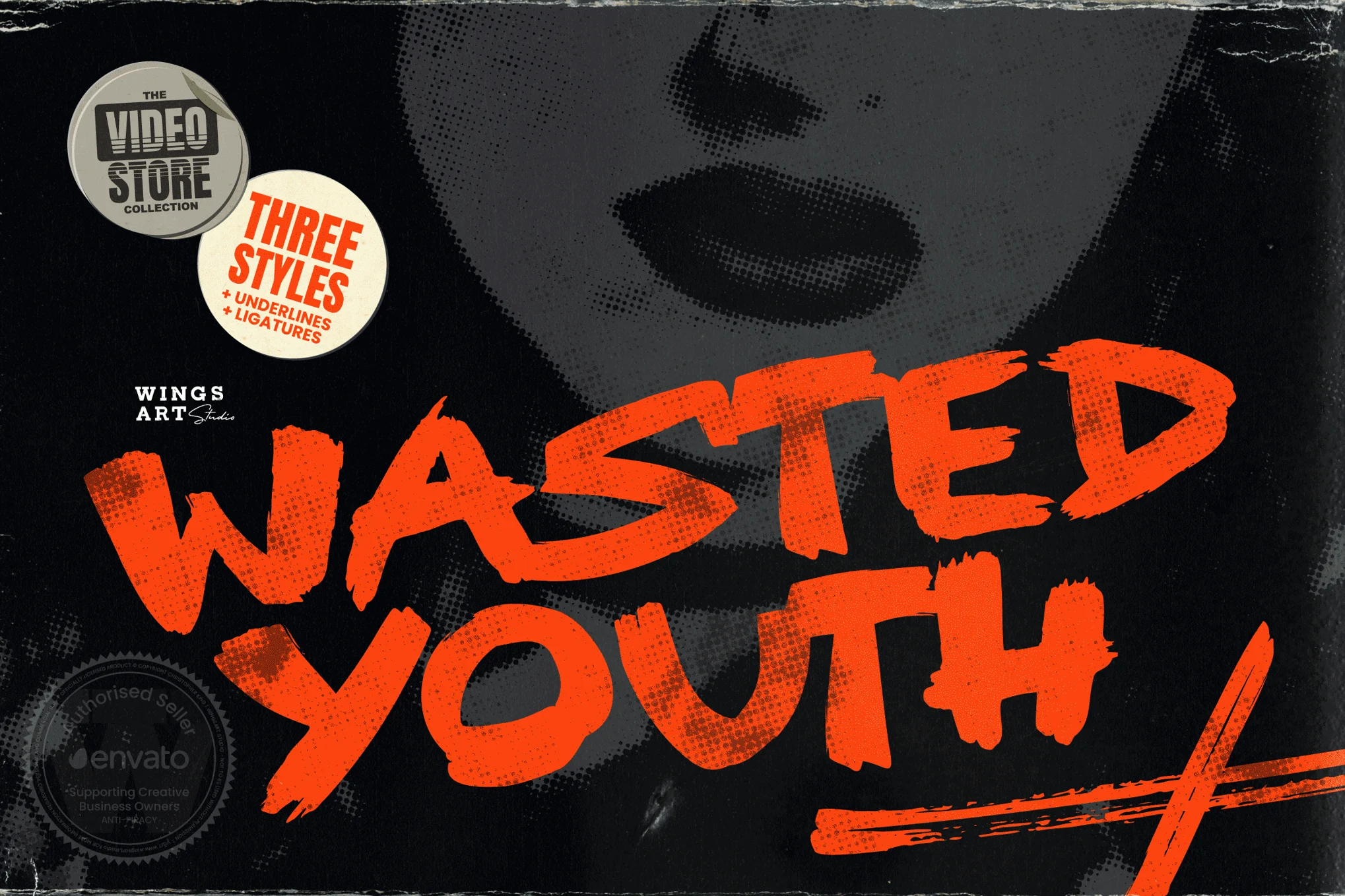
Wasted Youth Font is a unique font that has a sense of defiance to it with strong, thick lines. Among them, this font seems to focus on youth culture; it has irregular letters with dynamic strokes that look like graffiti.
Wasted Youth finds its application primarily in art and cities, which is why it is quite fitting for posters, album covers, or branding on clothing that can be seen on the streets. Its style is unique; therefore, the contemporary generation’s ideologies, such as creativity, noncompliance, and vitality, can be perfectly associated with its concept.
You can find more free Retro fonts here.
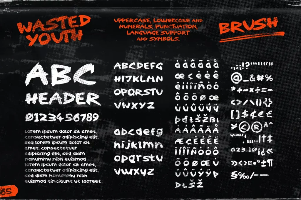
Uppercase, Lowercase & Symbols Font
Origin of Wasted Youth Font
The design of the Wasted Youth Font typeface came into existence due to the advancement in the urban arts, especially in the 1980s and early 1990s. The logo’s origin derives from graffiti art, with the designer aiming to capture the unadulterated spirit of rebellion characteristic of the youngest artists.
The font was an amalgamation of punk and hip-hop, which gained popularity within the subculture as a rebellion against the norms of society. Over time, Wasted Youth evolved from its early urban beginnings and became a part of mass culture—an illustrative emblem of youth activism and artistic endeavors.
Characteristics of Wasted Youth Font
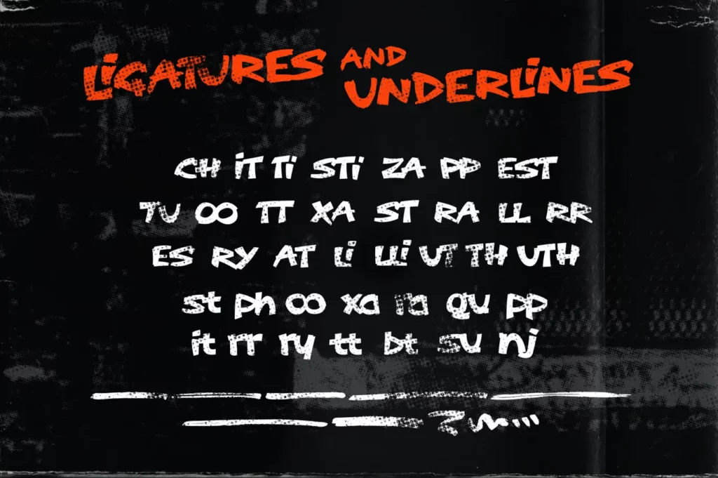
- Irregular Letterforms: All the characters have their subtle distortion of the form, which creates an effect of handmade work and references to street art.
- Dynamic Strokes: Nevertheless, the font contains different stroke weights, creating some dynamism that adds to the energy it portrays.
- Graffiti Inspiration: Influenced by graffiti from urban areas, the design embodies a spirit of rebellion, which makes it popular with youth and counter-cultures.
- Bold Appearance: With its thick, bold lines and confident design, Wasted Youth Font needs little introduction to become suitable for various uses.
- Expressive Personality: The typeface’s general appearance reflects a free and rebellious spirit that relates to creativity and independence.
- Versatile Usage: Wasted Youth is often used as a text in various settings, including posters, album covers, and apparel designs, serving the common purpose of conveying messages targeted at youths.
Uses of the Wasted Youth Font
Wasted Youth comes in multiple creative fields because of its highly imposing typography and unique style. Here are some common applications:
1. Music Album Covers
They are often used in punk/hip-hop and other music subgenres with the title Wasted Youth. This fact, combined with the aggressive look of the font, aligns it with the rebellious and individualistic motifs characteristic of music, ensuring its applicability in visually bright album art.
2. Streetwear Branding
Grunge and punk Cult Fashion brands that mainly appeal to youths have commonly used Wasted Youth in their logos, tags, and advertisements. The urban appearance is quite appropriate in terms of the spirit of streetwear, which consumers appreciate for its rebellious atmosphere.
3. Event Posters
Several concerts, festivals, and other mass events popular among youths feature the Wasted Youth font to draw attention. The jagged lettering and aggressive, rough lines of the text force event info against the background, creating a crowd of people who want to witness the lively atmosphere that the poster conveys.
4. Artistic Projects
Many graphic designers, whether designing for themselves or clients, seek Wasted Youth for its aesthetic appeal. Zines, limited edition prints, and promotional content for art shows all benefit from the font’s energetic strokes and extroverted personality.
5. Social Media Campaigns
In Wasted Youth, brands and influencers who want to reach young consumers incorporate it into social media icons, templates, and material. That’s Why the font is rather energetic, and headlines can be seen in crowded feeds, delivering bright and rebellious messages that urge to interact, share, or comment.
This font is free for personal use; click here for commercial use.

