Wistania Font
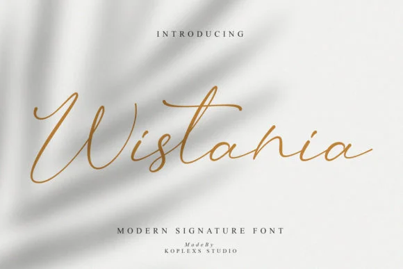
Wistania Font is a contemporary typeface known for its elegant and fluid design, making it a popular choice for various design projects such as wedding invitations, branding, and digital content.
Characterized by its clean lines and artistic flair, Wistania Font blends modernity with a classic charm, ensuring it stands out in print and digital formats.
You can find more free Curly fonts here.
Uppercase, Lowercase & Symbols Font

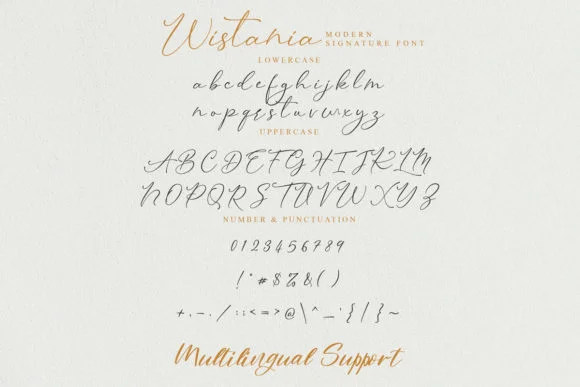
History of Wistania Font
The origins of the Wistania font trace back to the rich heritage of calligraphy, a timeless tradition that evokes a sense of craftsmanship and artistic finesse. A typeface steeped in historical influences, Wistania draws inspiration from classic scripts, yet it carves a distinctive path with its modern sensibilities.
The font’s name conjures an enigma air reminiscent of a bygone era where scribes meticulously handcrafted every letter. Its evolution from pen to pixel encapsulates the trajectory of craftsmanship in the digital age, where the old-world charm of calligraphy coalesces with the precision of digital design.
Key Features of Wistania Font
Wistania Font is not your everyday font—its features are as unique as they are versatile. Here are some of the defining characteristics that have made Wistania a darling of the design world:
- Serif Elegance with a Twist: Wistania’s serifs indicate its classical lineage, yet they are imbued with a subtle vivacity that sets them apart. The strokes are adorned with finials and swashes, adding a graceful touch to the text.
- Variable Weights for Adaptive Designs: The font is available in various weights, allowing dynamic use in branding, editorial, and web design. Whether a bold headline or a delicate byline, Wistania adapts seamlessly.
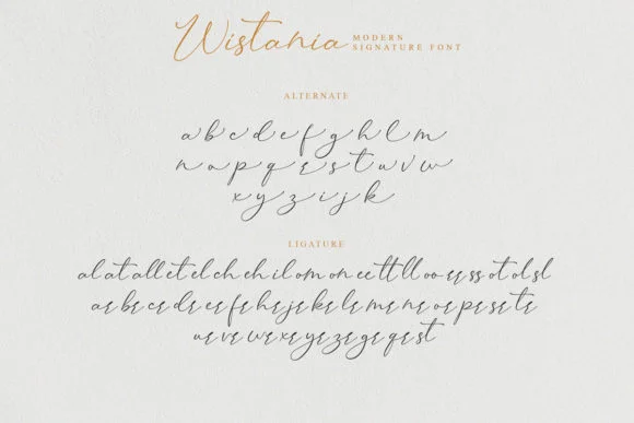
- Ligatures and Stylistic Sets: Tailor your typography with ligatures and stylistic alternates that orchestrate a harmonious interplay of letters. These features enable a deeper level of textural richness and aesthetic customization.
- High-Legibility Even at Smaller Sizes: Despite its ornate qualities, Wistania remains highly legible even at smaller sizes, a feat rarely accomplished by typefaces with such flamboyant detailing.
Applications of Wistania Font
The breadth of applications for Wistania is as expansive as your imagination. From print to digital, it leaves its indelible mark on every canvas it graces.
Branding with Distinction
A brand typified by elegance can find its voice in Wistania. Logotypes, taglines, and any brand communication benefit from the font’s sophistication, creating a memorable and luxurious brand identity.
Editorial Excellence
Wistania finds a natural home in editorial design. Its ability to convey a classic aesthetic infused with contemporary allure makes it an excellent choice for publications seeking to engage and inspire their audience.
Crafting Digital Experiences
Even in the digital realm, Wistania shines. It brings a touch of the bespoke to websites and digital campaigns, resonating with an audience who values craft and authenticity.
Beyond the Screen
Packaging, signage, and environmental graphics represent physical touchpoints where Wistania can provide a unique expression. Its presence elevates the sensory experience, lending a tactile depth to visual communication.
How to Use Wistania Font
Integrating Wistania into your projects is straightforward, yet vital aspects must be considered to leverage its potential fully. Bear in mind the following guidelines to maximize the impact of Wistania font within your designs:
- Understand the Context: Before selecting any font, including Wistania, assess the context of your project. Determine whether its elegant and intricate style aligns with the message and tone you wish to convey.
- Pairing Fonts: While Wistania stands out, pairing it with a complementary font can enhance your design. Consider a sans-serif font for body text to balance Wistania’s decorative serifs and maintain readability.
- Experiment with Weights and Styles: Use the various weights and styles available. Bold weights can impact headlines, while lighter weights work well for body text. Stylistic sets and ligatures offer creative expression, so experiment to find the best fit for your project.
- Mind the Legibility: When designing for smaller screens or print sizes, ensure the font remains legible. Test different sizes and weights to maintain readability across all devices and formats.
- Licensing and Usage Rights: Ascertain you have the appropriate licensing for using Wistania font in your project. This is crucial for avoiding legal issues and respecting the font creator’s rights.
By adhering to these pointers, you can effectively incorporate Wistania into your designs, elevating your projects with its unique charm and versatility.

