Zombie Punks Font
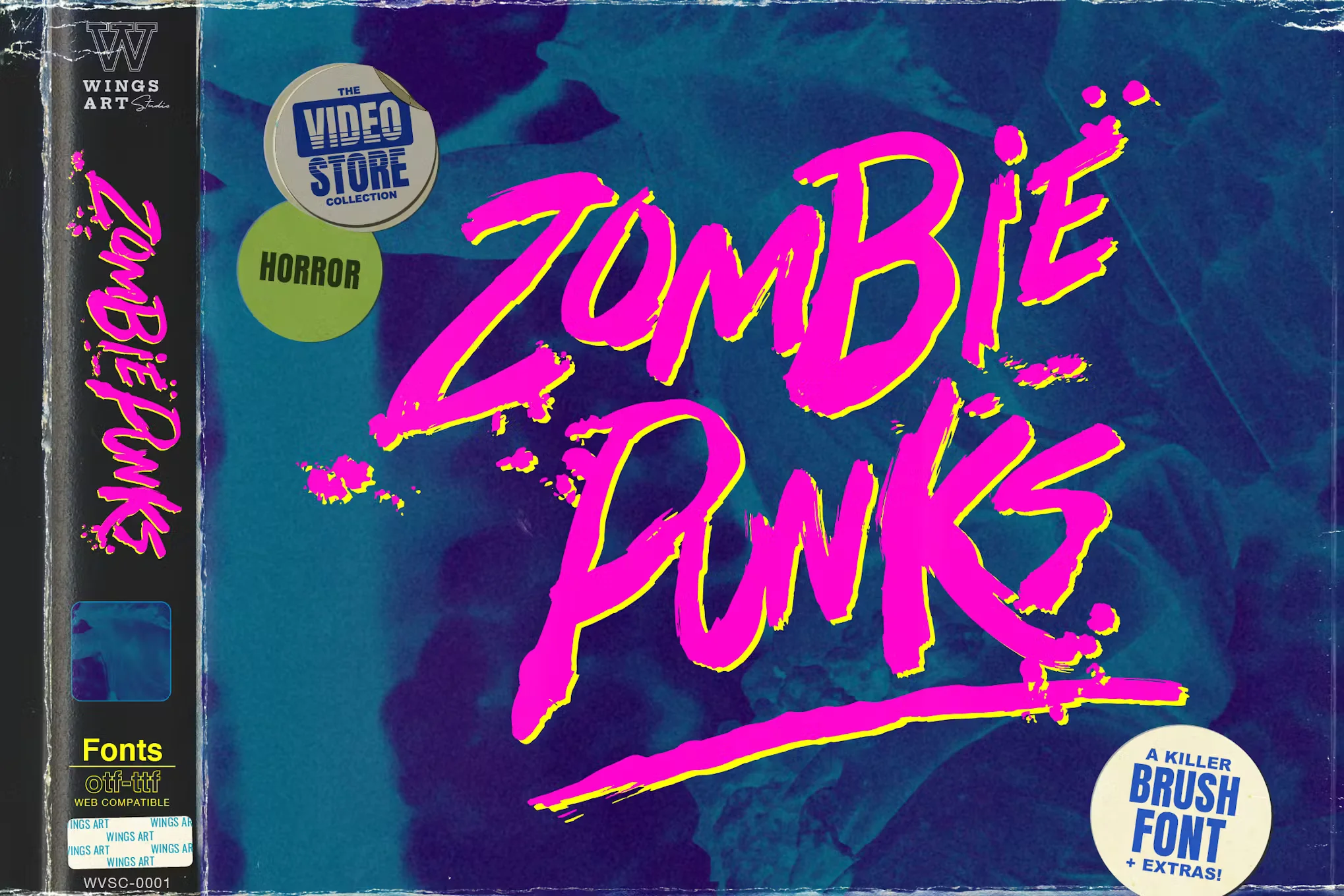
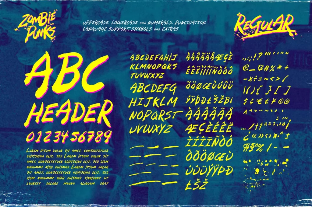
Zombie Punks Font is a distinctive typeface characterized by its edgy, rebellious design that draws inspiration from punk culture and the gritty, post-apocalyptic aesthetic commonly associated with zombies.
It features irregular, rough-textured letters that seem to bring the anarchic spirit of punk and the unsettling charm of zombie lore to any textual content. This font is often used in media or artwork to convey a sense of decay, rebellion, or dystopian unrest, making it a popular choice among graphic designers looking to make a bold statement.
You can find more free Movies fonts here.
Uppercase, Lowercase & Symbols Font
Origin and Inspiration of Zombie Punks Font
Zombie Punks wasn’t born in a velvet-lined studio by a designer sipping artisanal coffee. No, this font drips with grunge and rises from the creative rebellion that punk culture embodies. Trace its origin story back to a dark, humid night where the flicker of a guitar amplifier met with the moans of the undead, and you’ll begin to understand where Zombie Punks truly began.
The Fusion of Horror and Rebellion
The mind behind Zombie Punks, designer Viktor Solt-Bittner, speaks of a font created not from the disdain for conventional typefaces but from a place where the anarchy of punk was ethereally entwined with the macabre allure of zombie lore. It’s a testament to the versatility and symbolic power of typography, where letters themselves become the harbinger of terror and tenacity.
Capturing the Punk Spirit
More than just a set of letters, Zombie Punks reflects the punk movement’s DIY ethos. Each jagged, distressed edge and every inexplicable jutting ascender or descender is a rebellion against the norms of clarity and symmetry, mirroring the art of anarchy that punk stands for.
Key Features of Zombie Punks Font
Zombie Punks is not just another font added to the vast ocean of typography; it is a statement, a rebellion in design. Below are some of the key features that set it apart:
- Distinctive Decay Aesthetic: Each letter in the Zombie Punks font has been meticulously designed to embody the decay and degradation reminiscent of zombie flesh and punk’s raw edge. This unique aesthetic makes the font perfect for projects that demand a touch of horror and audacity.
- Handcrafted Irregularity: Zombie Punks stands out with its intentional irregularities. No two letters are identical, mimicking punk culture’s unpredictable and DIY spirit. This handcrafted touch injects authenticity and personality into every design.
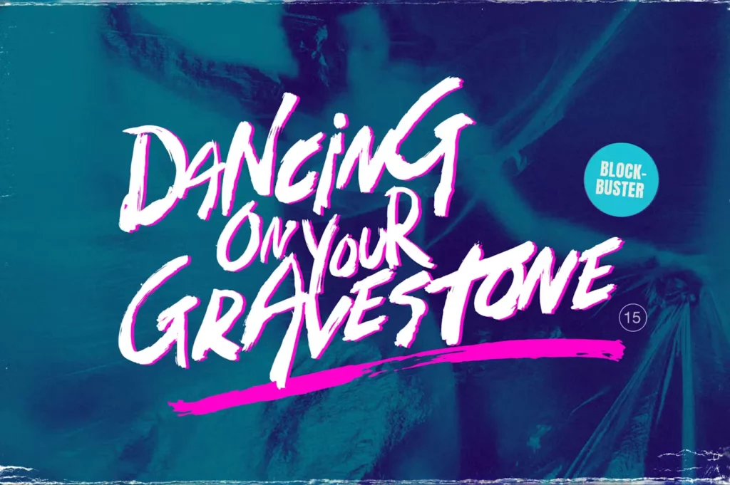
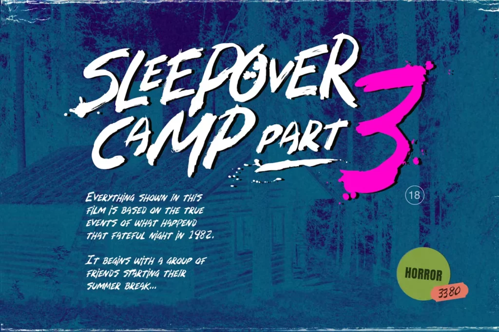
- Versatile Application: Despite its niche appearance, Zombie Punks is surprisingly versatile. It’s not just for Halloween or horror-themed projects; it can also lend a striking edge to music posters, album covers, edgy branding projects, and any design that dares to stand out.
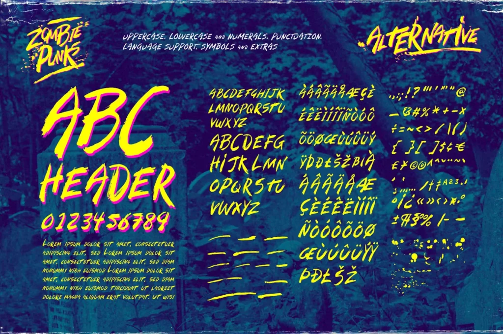
- Extended Glyph Set: Zombie Punks offers a comprehensive set of glyphs that support multiple languages and special characters. This feature ensures that designers are not limited in creativity and can employ the font in various projects.
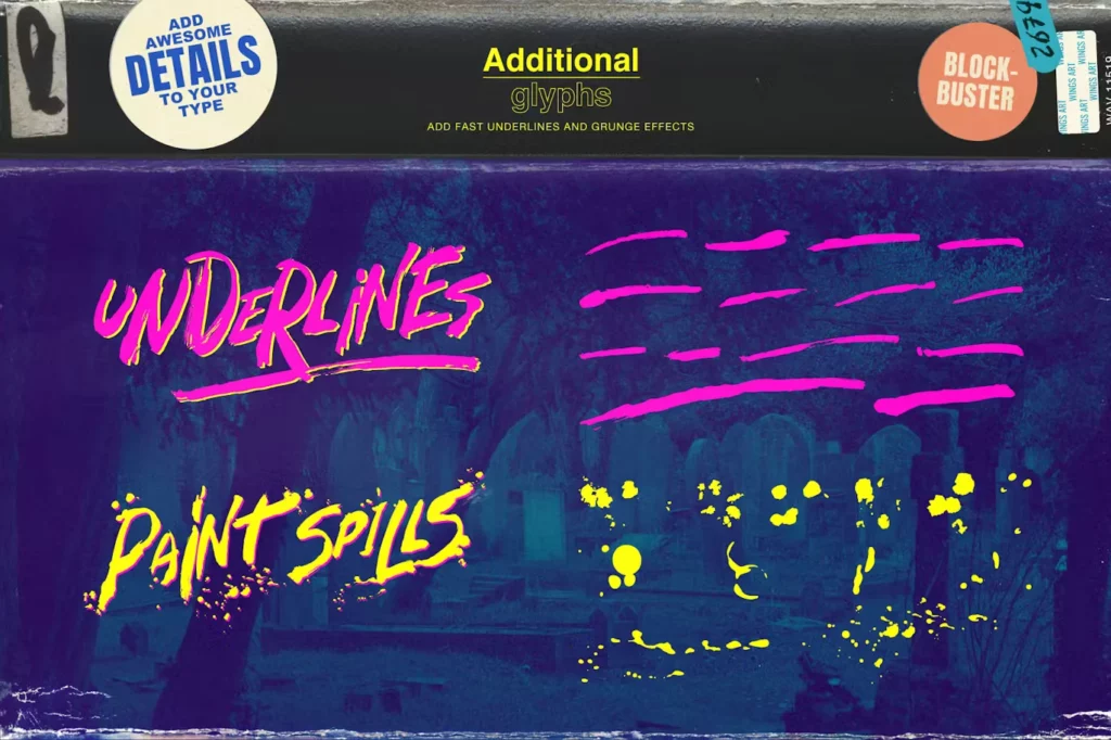
- Adjustable Roughness Levels: Understanding the varied needs of projects, Zombie Punks comes with adjustable roughness levels. Designers can fine-tune the grunge effect, from subtly distressed to aggressively decayed, to suit the mood of their project perfectly.
Uses of Zombie Punks Font
Where can the Zombie Punks font crawl into and leave its mark? The answer might surprise you—everywhere. From the small Tinder of social media posts to the larger pyres of billboards, this typeface is finding relevance in various settings, and designers are just beginning to tap into its potential.
Design that Ranks Graveyard-Smashing Engagement
Zombie Punks might be graphic design’s worst nightmare and the marketer’s sweetest dream. Its compelling nature translates into high engagement, where social cards and online advertisements can enjoy a significant uptick in interaction simply due to the arresting nature of the font.
A Sinister Invitation in Print
The print industry, too, isn’t immune to the charm of Zombie Punks. Invitations, posters, and even the edgiest of magazine spreads can sport punky typography to bring an element of surprise to the reader, a promise of an experience out of this world (and into the next).

