Bad Grunge Font
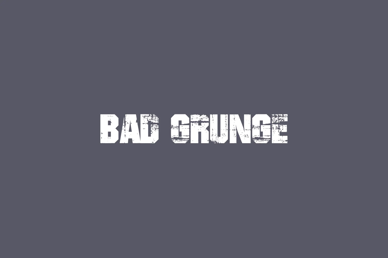
Bad Grunge Font refers to a type of typeface that embodies the raw, unrefined textures and styles reminiscent of the grunge music scene of the early 1990s.
Characterized by its intentionally messy, irregular, and sometimes decayed appearance, Bad Grunge Font captures the rebellious spirit of the era. It is often used to convey a sense of edginess, authenticity, and individuality in design projects that seek to break free from polished, conventional aesthetics.
You can find more free Destroy fonts here.
Uppercase, Lowercase & Symbols Font
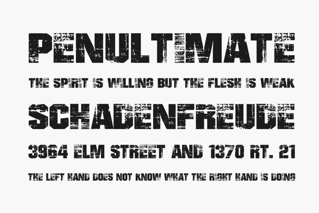
History of Grunge Font
The grunge font style was born out of the gritty music and art scene of the 1980s, carving a niche for itself in the counter-culture movements of the time. Peaking in popularity during the 1990s, particularly in the heyday of grunge rock, these fonts reflected the DIY ethos of the artists who made them.
Typically characterized by irregularity, distress, and a sense of urban decay, grunge fonts expressed rebellion against the polished serifs and sans-serifs that dominated the pre-digital era.
Features of Bad Grunge Font
Grunge fonts, often termed “Bad Grunge Fonts,” stand out due to their distinctive features, which contribute to their edgy and raw appeal. Some of these defining characteristics include:
- Irregular Borders: Grunge fonts frequently exhibit rough, uneven edges, unlike their polished counterparts. This irregularity mimics the effect of ink bleeding or spray paint on uneven surfaces, adding to their rebellious aesthetic.
- Texture Variations: One of the hallmarks of grunge fonts is their varied textures. They often feature a combination of scratches, smudges, and other marks that suggest a degree of wear and tear, resembling posters or walls in urban settings.
- Inconsistencies in Letter Shapes: Reflecting the non-conformist ethos, the letterforms in grunge fonts often vary considerably in shape and size. This lack of uniformity challenges traditional design norms and adds a unique character to the font.
- Transparency and Overlapping: Many grunge fonts incorporate elements of openness, where parts of letters may seem faded or completely missing. Others may have letters overlapping messily, contributing to a sense of depth and spontaneity.
- Unconventional Ligatures and Kerning: Grunge typography sometimes disregards conventional ligature usage and kerning rules, resulting in unexpected gaps or connections between letters, which can further enhance the chaotic aesthetic.
These features give bad grunge fonts their distinctively raw, authentic look, making them a bold choice for conveying certain moods or themes in graphic design projects.
Tips for Using Bad Grunge Font
Can a designer incorporate a wrong grunge font in their work without becoming an aesthetic train wreck? The short answer is – yes, but with caution and a clear objective. Here are some tips for using bad grunge fonts effectively:
Know When to Use Them
Grunge fonts should be used when communication demands it. They are not your go-to options for a corporate report or the sleepy life of a financial bulletin. However, they can be potent for event posters, band logos, or to create a visceral impact in a marketing campaign.
Balance is Key
If using a wrong grunge font, ensure that the rest of the design especially relies on structure and balance to create a visual contrast. The surrounding elements should frame and enhance the grunge font, not compete with it.
Use Judiciously
A little grunge goes a long way. Overusing such fonts can quickly turn a design into a messy, unreadable piece.
Layering for Effect
Mixing a grunge font with clean, bold typography or graphic elements can create an arresting juxtaposition that draws the eye and enlivens the design.

