How to Choose a Font for Web Design

The digital realm is an ocean of information, and on the web’s vast shores, typography acts as a lighthouse, guiding users through the surf of content. In web design, a font is not just a decorative element; it’s a conduit of communication that conveys the essence of a brand, the tone of a message, and the visual hierarchy of a page.
Whether you’re a seasoned graphic designer or a budding web developer, understanding how to choose the right font for your web projects is a skill that cannot be overstated.
Understanding Fonts
Before we can explore the nuances of font selection, it’s crucial to understand the varieties at your disposal.
“Serif vs. Sans-Serif” Isn’t a Comic
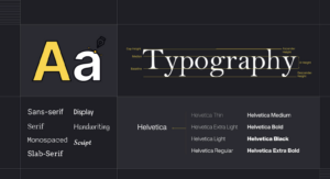
The distinction between serif and sans-serif fonts is a bedrock of typographic design. Serif fonts are characterized by the small lines that are attached to the strokes of letters, making them more traditional and often associated with print. Sans-serif fonts, on the other hand, are clean and modern, without these extensions.
Script and Display for a Personal Touch
Script fonts mimic cursive handwriting, offering a more personal and expressive feel appropriate for certain brands or decorative elements. Display fonts, often ornate and not ideal for large bodies of text, can add a striking impact to headlines or logos.
Factors to Consider
Choosing a font goes beyond personal preferences; it is a deliberate decision that should be based on several critical factors.
The Purpose and Tone of Your Website
Consider what the site is for; is it a corporate entity aiming for a sleek and professional look, or a blog seeking a more casual and approachable demeanor? Each objective suggests a different typographic approach.
Know Thy Audience
Your target demographic plays a significant role in font selection. A younger audience may respond well to trendy, more ornamental fonts, while older users might appreciate clarity and simplicity.
Cross-Compatibility Is Key
The font you fall in love with should perform on all devices and browsers, as inconsistency would mar your design. Always ensure that the font you choose can render effectively across various platforms.
Best Practices
With a sense of the font landscape, it’s time to embody best practices to ensure typography excellence in your web design projects.
Pairing Fonts for Harmony
Pairing fonts can add dynamism to your design if done skilfully. Choose one for headlines that complements the font used for the body, creating a harmonious text aesthetic.
Size Matters, Literally
The size of your font is not an arbitrary choice. A 10-point font is fine for a legal disclaimer, but a webpage that’s trying to communicate effectively should aim for a larger, more readable size, commonly starting at 16px for body text.
Line Spacing and Contrast Keep It Readable
Adequate line spacing and contrast ensure that text can be read comfortably. When text is too crowded or blends into the background, it deters from the reading experience. A general rule of thumb is to have a line spacing that’s 1.5 times the font size.
Tools for Font Selection
Thankfully, you don’t have to tackle the web typography universe alone. Several excellent tools and resources exist to help you along the way.
Google Fonts and Beyond
Google Fonts offers a vast selection of web-safe typefaces, but exploring other services and foundries like Adobe Fonts or Typekit could yield unique options that better suit your needs.
Test, Test, Test
Always test your chosen fonts within the actual design to see how they look in context. What seemed perfect on a list may prove challenging to integrate in your layout.
Keep Accessibility in Mind
Besides aesthetic appeal, the fonts you choose should be accessible. Contrast should be high enough to make reading easy, and you might need to explore typefaces with open counter forms to aid those with visual impairments.
Case Studies
The theoretical framework of font selection becomes clearer when we examine real-world examples.
A Banking Site Goes With Sans
A leading finance corporation revamped its website by choosing a sans-serif font for its modern, trustworthy, and approachable characteristics.
A Social Media Platform’s Play on Script
A popular visual-heavy platform opted for a script font in its logo to convey a sense of creativity and personal connection, a strategy well-aligned with its user base.
Conclusion
Selecting the right font for web design is part art, part science. It requires an understanding of the brand and its audience, as well as a discerning eye for what works within the design. By following these guidelines, you can elevate your web projects from the sea of sameness and design pages that truly stand out.
Remember, typography is the voice of your website; make sure it’s saying what you truly intend. Engage with the design community, experiment with new typefaces, and fine-tune your choices until they resonate with your unique vision. Through thoughtful consideration and a keen awareness of the factors at play, you can craft digital experiences that not only look good but also read well and communicate effectively.
Armed with this advice, venture forth and may your web designs be beautifully, legibly, and engagingly typed. Have questions or want to share your typographic triumphs? Feel free to reach out and share your experience. After all, in the sharing of wisdom, we become better designers together.


