The Classification of Typeface Styles

Typefaces are the voice of the written word in visual communication, and understanding them is crucial for any designer, developer, or enthusiast in the creative field. Just as you can distinguish different musical genres by their unique notes and tones, typefaces can be classified into distinct styles that convey varied emotions, messages, and intentions.
This post will take you on a compelling typographic journey, exploring the root of typeface classification, the major categories, the nuances of font families, and the pivotal role typography plays in design.
Introduction to Typeface Styles
Typefaces are to design what spices are to cooking—a subtle addition that can totally transform the experience. Without typefaces, our world of words would be a bland, uniform expanse. But with them, the visual landscape is rich and varied, echoing the multitude of voices we hear in everyday life. The need for classification arises from the vast number of typefaces available. By organizing them into distinct styles, we can understand and utilize them more effectively.
Historical Perspective
Typeface classification has a rich history that’s as old as the written word itself. From the days of punchcutters and scribes, there was a need for standardization and recognition of different letterform styles. This formalization of typeface styles began with Johann Gutenberg’s invention of the movable type press in the 15th century and has evolved through the centuries to become the system we recognize today.
The Main Typeface Categories
Serif
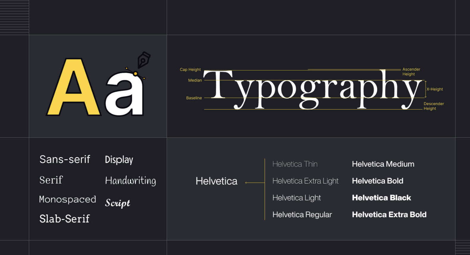
Serif typefaces, with their elegant and historical association, are characterized by the small lines or flourishes at the ends of the strokes. They’re often used in print for body text, imparting an authoritative and traditional feel. Classic examples include Times New Roman and Baskerville.
Sans Serif
Contrary to serifs, Sans Serif types are stripped of these decorative lines, resulting in a clean, modern look. They’re highly legible and are frequently used in digital environments for their clarity. Helvetica and Arial are two well-known sans serifs.
Script
Script typefaces mimic cursive writing and are popular for invitations and branding due to their personal and decorative nature. They range from formal to casual, cursive to printed. Examples include Zapfino and Bickham Script.
Display
Display types are designed for large sizes and headlines, making them perfect for grabbing attention. Often ornate or highly stylized, they are not typically used for extended reading. Some popular display typefaces are Cooper Black and Impact.
Monospaced
Monospaced typefaces allocate an equal amount of horizontal space to each letter. These are commonly found in technical settings or to create a distinct, retro look. Courier and Consolas are two monospaced staples.
Understanding Font Families
A font family is a group of related fonts that share similar features, such as the same basic design but in different weights or styles. These variations can include italic, bold, light, condensed, or extended. Understanding font families allows designers to use typefaces with consistency and variety within their designs.
The Role of Typography in Design
Typography is not just about picking pretty letters—it’s an art and a science that influences how text is understood and felt. Choosing the right typeface can make or break the message of a design. It affects everything from readability to the expression of brand identity. It’s not just about what looks good; it’s about what serves the purpose best.
Emerging Trends in Typeface Design
The landscape of type is constantly shifting, as designers push the boundaries of what’s possible. Trends such as variable fonts, handmade and retro styles, and innovative display types are just the tip of the letterform iceberg. Staying abreast of these changes is vital for any designer aiming to be at the forefront of their craft.
Best Practices for Typeface Selection
Selecting a typeface is an art in itself. When does a project need the formality of a serif, or the approachability of a sans-serif? What combinations work well in contrast or harmony? These are questions that any designer must consider. Practical tips and guidelines can help to demystify the process and guide you to a successful pairing.
Conclusion
The world of typefaces is a vibrant one, with much to explore and understand. By recognizing the role they play, the history behind them, and the trends ahead, we enrich our ability to communicate through design. Typography, after all, is the meeting point of form and function in visual art.
Additional Resources
Typography is a topic as deep as the soul of language itself. The above exploration is just a primer for a budding designer. For those inspired to venture further into the realm of type, be sure to check out the following resources:
- Websites like Typewolf and Typographica offer detailed guides, trends, and reviews on type design.
- Books such as ‘Thinking with Type’ by Ellen Lupton provide insightful reading on the theory and practice of typography.
- Tools like Adobe Fonts and Google Fonts offer a vast library of typefaces for exploration and use in your projects.
Remember, type selection should be thoughtful, adventurous, and always in service to the design’s purpose. Now, armed with this understanding, go forth and create typographically rich designs that speak clearly and beautifully to your audience. So, never underestimate the power and potential of typefaces in your designs. Keep experimenting, keep learning, and you’ll be on your way to becoming a master typographer.

