Lato Font
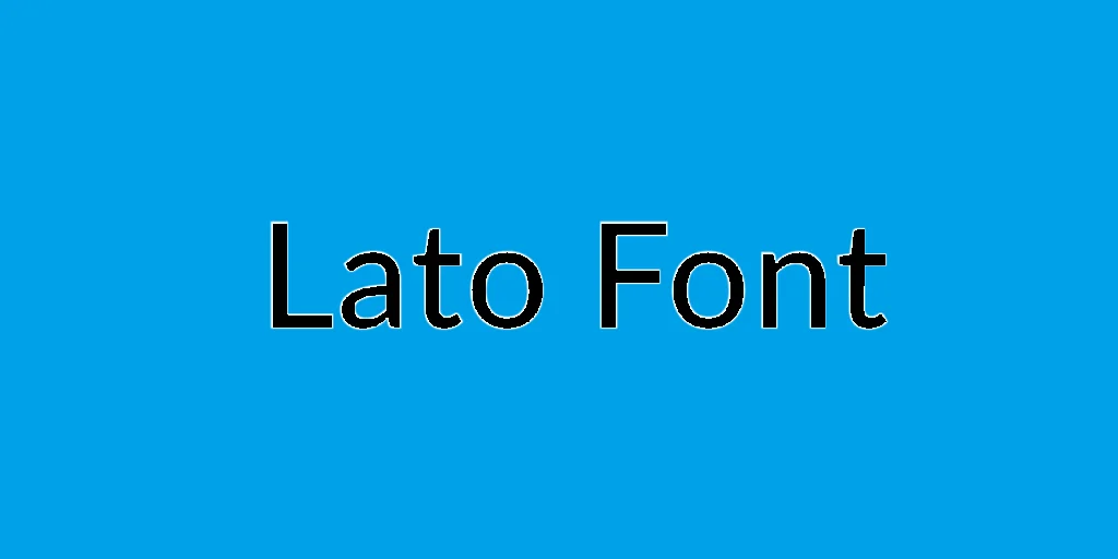
Lato Font is a sans-serif typeface family designed by Warsaw-based designer Łukasz Dziedzic in the summer of 2010. Initially, Lato was created as a set of corporate fonts for a large client, who went in a different style, leaving Lato available for public use. “Lato” is Polish for “summer,” reflecting the font’s clear, crisp, and open character.
Since its release, Lato has been widely adopted for print and digital media. It is recognized for its versatility across various platforms and screen sizes, excellent readability, and a harmonious balance between professional and friendly tones.
You can find more free sans-serif fonts here.
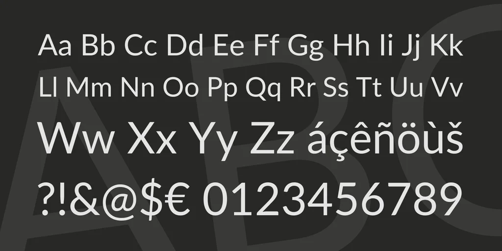
Uppercase, Lowercase & Symbols Font


History and Background of Lato Font
The genesis of Lato dates back to 2010 when the renowned Warsaw-based type designer Łukasz Dziedzic crafted it as a free alternative to Helvetica. The word ‘Lato’ means ‘summer’ in Polish, reflecting the font’s warm and approachable appeal.
Since its inception, it rapidly gained popularity due to its clarity and modern aesthetics, making it a preferred choice for many designers and developers around the globe.
Characteristics of Lato Font
Lato is distinguished by its friendly yet professional appearance, which makes it exceptionally versatile for both digital and print media. Below are some key characteristics that define Lato Font:
- Humanist Sans Serif: Lato falls under the category of humanist sans serif fonts, which means it incorporates organic, human-like qualities into its letter shapes, offering a more warm and friendly feel than other sans serif fonts.
- Open and Clear Letterforms: Lato’s design emphasizes openness and clarity in its letterforms, making them highly legible even in small sizes or when used in dense blocks of text.
- Semi-rounded Details: Lato features semi-rounded details of the letters, which contribute to its warm, approachable character and enhance readability.
- Versatile Weight Range: Lato offers a wide range of weights, from hairline to black, enabling designers to create dynamic typographic hierarchies and contrast in their layouts.
- Subtle Eccentricity: Despite its general simplicity, Lato includes subtle touches of eccentricity in its characters, such as a slightly curved lowercase “t” and a tail on the lowercase “l,” which add uniqueness to the typeface without sacrificing legibility.
- Optimized for Screen Use: Although versatile enough for print, Lato is particularly optimized for screen use, displaying excellence in clarity and readability across various digital devices and resolutions.
Benefits of Using Lato Font
Here are some benefits of using Lato Font:
Legibility and Readability
With Lato, legibility is a given. The font excels in digital and print media, ensuring your message is communicated effectively. The typeface’s open apertures and large counters contribute to its clear reading, especially in body text sizes.
Extensive Weights and Styles
Lato’s versatility shines through its numerous weights and styles. This flexibility allows for hierarchical typographic structures and creative expression. You can beautifully integrate Lato Light for a minimalist approach, while Lato Black adds a bold and impactful statement to your designs.
Multilingual Support
In our interconnected world, catering to diverse languages is vital. Lato rises to the challenge, supporting an extensive range of Latin-based languages, making it an inclusive choice for multi-national brands and projects.
How to Use Lato Font
Lato works effectively in various design applications, including:
- Web Design: Lato is a popular choice for web design due to its optimized screen appearance. It also pairs well with other fonts, such as Roboto or Montserrat.
- Print Design: Whether used in brochures, posters, or business cards, Lato adds a touch of professionalism and modernity to any printed material.
- User Interface Design: Lato’s legibility makes it an excellent option for user interface design, where clarity is crucial for effective communication.
- Brand Identity: With its extensive weight range and support for multiple languages, Lato offers an ideal choice for branding projects, ensuring consistency across various platforms.


