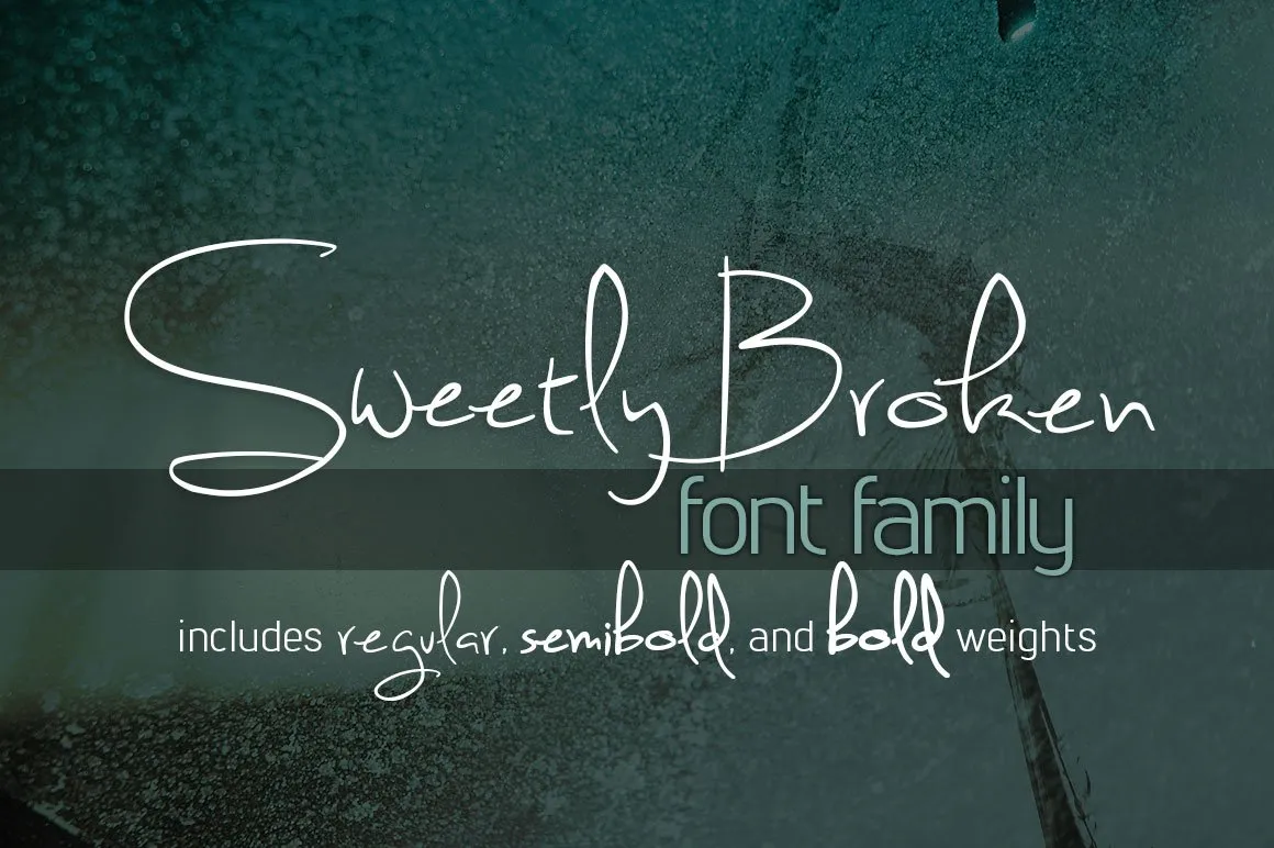
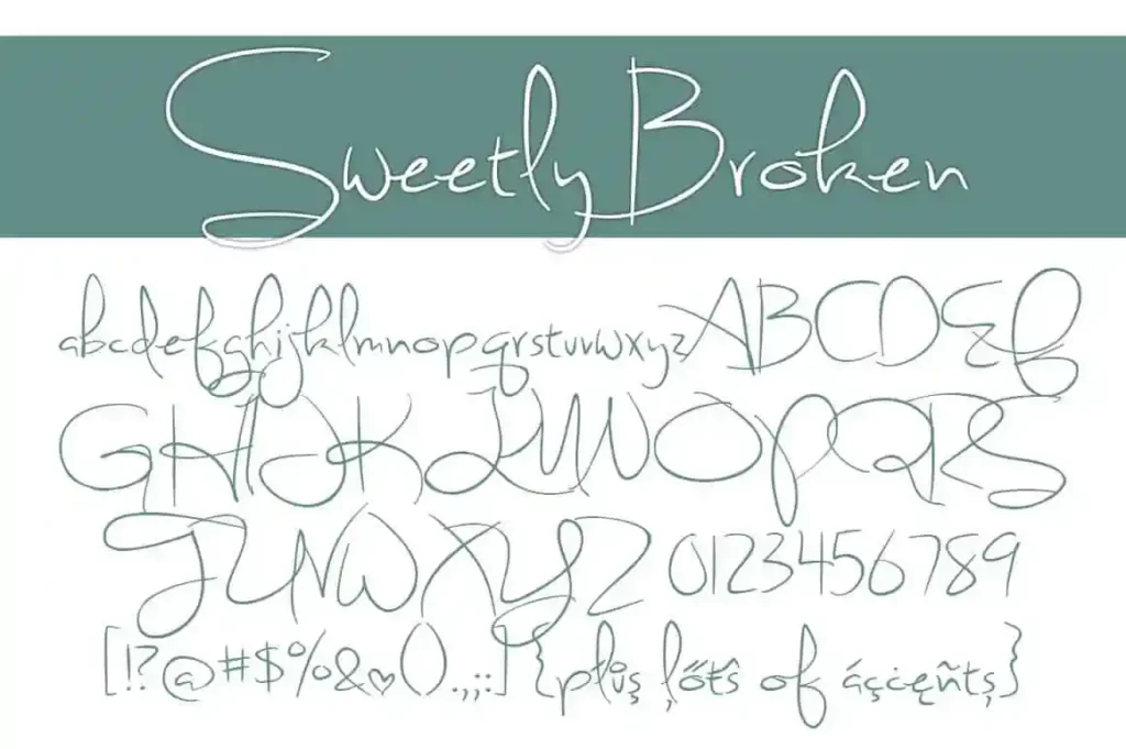
Sweetly Broken Font

Sweetly Broken is a contemporary typeface known for its distinctively smooth and flowing hand-written appearance. Characterized by its casual elegance, this font merges the personal touch of hand lettering with the readability and versatility of digital typography.
Ideal for a wide range of applications, from branding and wedding invitations to social media graphics, Sweetly Broken offers a warm, approachable vibe that resonates with both designers and viewers alike.
You can find more free Handwritten fonts here.
Uppercase, Lowercase & Symbols Font

History of the Sweetly Broken Font
Sweetly Broken Font was crafted with a story in mind, a narrative that resonates in the subtle details and emotive strokes. Its origins are as charming as its name. Designed by the acclaimed typographer, Lillian Buttermore, this font emerged from her love for vintage calligraphy and a desire to fuse traditional craft with a modern aesthetic.
Opening her design studio to the world, Lillian released the Sweetly Broken Font. From its debut, it garnered an avid following of designers who sought to infuse warmth and character into their creations.
Applications of the Sweetly Broken Font
Sweetly Broken Font has found its place in a wide range of design applications, celebrated for its ability to convey warmth and personality seamlessly. Here are some of the primary uses:
- Branding and Logo Design: Its unique blend of modern and vintage styles makes Sweetly Broken an excellent choice for brands looking to stand out. The font’s distinctive character adds a personal touch to logos, making them memorable and engaging.
- Editorial Design: From magazine headers to article bylines, Sweetly Broken brings an element of sophistication and readability, enhancing the overall visual narrative of print and digital publications.
- Wedding Invitations and Event Stationery: The font’s charm and elegance breathe life into invitations, programs, and other event-related materials, providing a bespoke feel that’s both inviting and expressive.
- Product Packaging: Products leveraging the Sweetly Broken Font in their packaging design can communicate quality and attention to detail, promising an emotive and authentic unboxing experience.
- Social Media Campaigns: For brands aiming to connect on a more personal level with their audience, Sweetly Broken offers a relatable and friendly tone, perfect for captions, quotes, and calls to action.
How to Use the Sweetly Broken Font
Successfully integrating the Sweetly Broken Font into your design projects involves more than just choosing the font from your library. It’s about understanding the unique characteristics and best practices to ensure it complements your work. Here are some tips for using the font effectively:
1. Choosing the Right Context
The key to maximizing the impact of Sweetly Broken is to use it in the right context. Due to its distinctive style, it works best in projects that aim to evoke emotion or nostalgia. It’s perfect for industries like wedding planning, boutique businesses, and artisanal brands.
2. Pairing with Complementary Fonts
While Sweetly Broken can stand alone, it also pairs beautifully with sans-serif and serif fonts for text body. For a balanced design, use simpler fonts for body text to ensure readability and let Sweetly Broken shine in headings and accents.
3. Paying Attention to Kerning and Spacing
Sweetly Broken’s unique letterforms mean that kerning (the space between specific pairs of letters) and spacing can significantly affect readability. Adjusting these elements manually can help maintain the aesthetic appeal without compromising the text’s legibility.
4. Color and Background Tips
This font’s intricate details are best showcased against high-contrast backgrounds. Opt for solid colours and avoid overly busy textures. When it comes to colour choices, softer, muted tones can complement the font’s vintage flair, while bold colours can make it stand out.
5. Size Matters
Given its decorative nature, Sweetly Broken Font is most impactful at larger sizes where its details can be appreciated. When using it for headings or logos, don’t shy away from scaling it up. For body text or smaller details, consider simpler, more legible fonts to ensure clarity.


